
2022
Editorial
Sound
Neograd Didot
Mugogo
FlexFab
Ziller Bas
2021
Art Print
Editorial
Photography
Autopsie d'un accident
Guillaume Perret
Théophile Glauser


2021
Editorial
Identity
Poster
74e Biennale
Musée des beaux-arts
La Chaux-de-Fonds



2020
Editorial
Sound
MB New Religion
Mantras
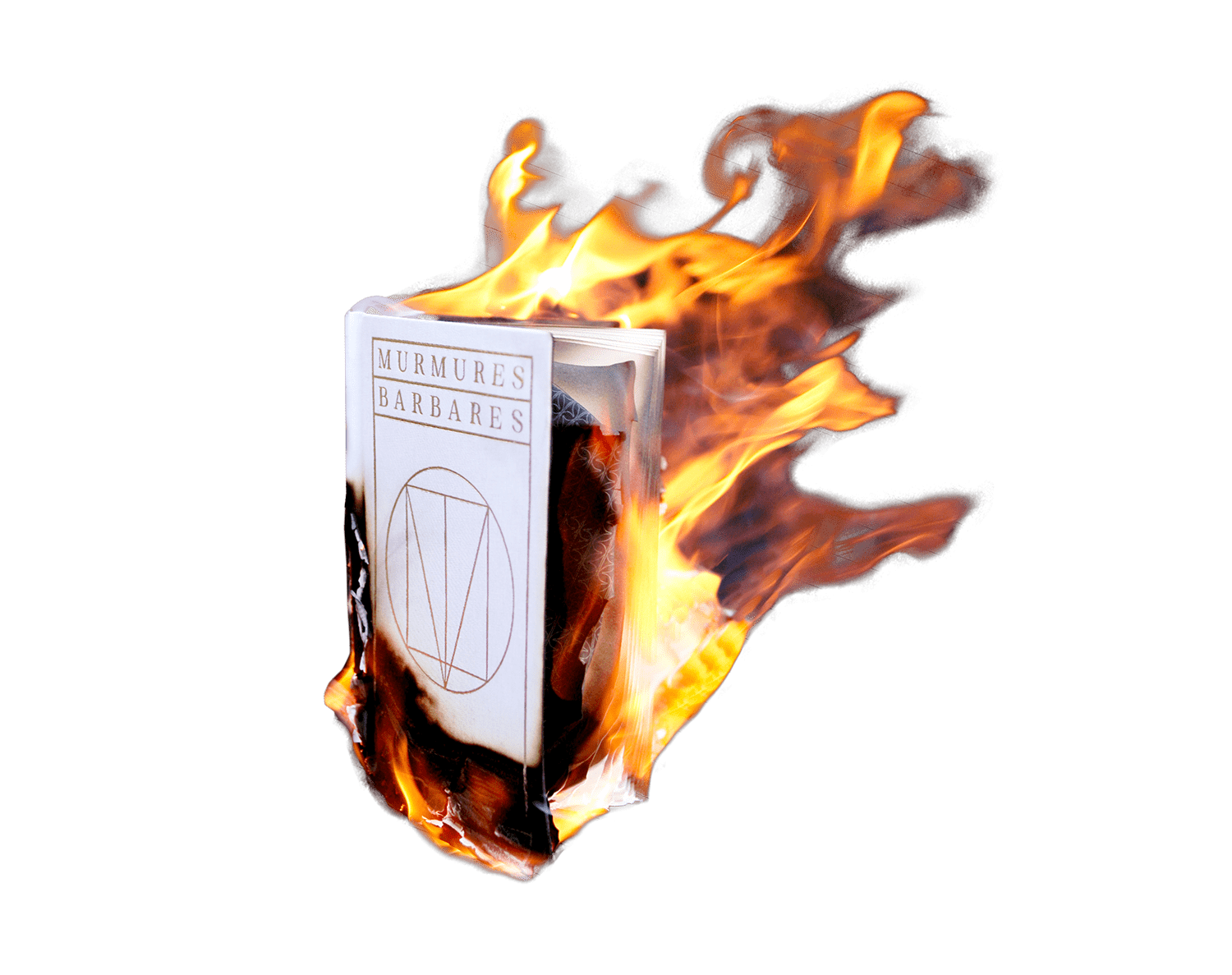
Murmures Barbares
2020
Editorial
Photography
Neograd
Vision Vizjila
Alexandre Girod
NORT
2019
Editorial
Sound
Black Water
Analog Flood
Inuit Pagoda
2019
Art Print
Editorial
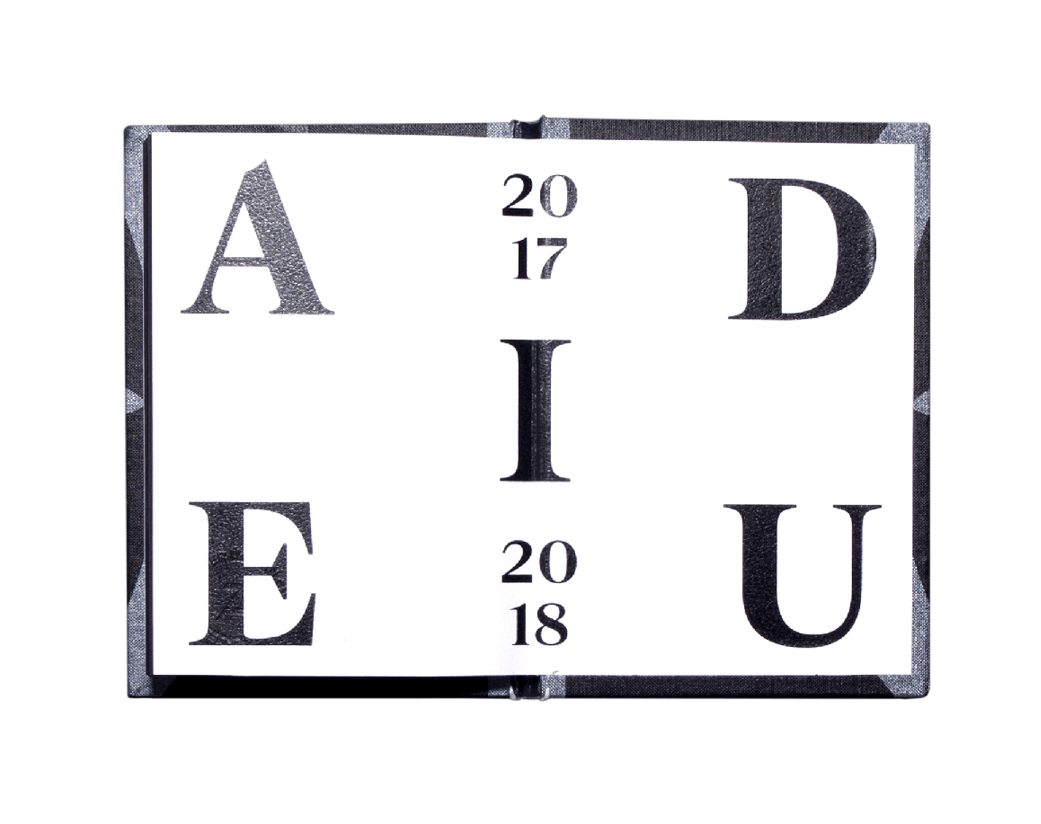
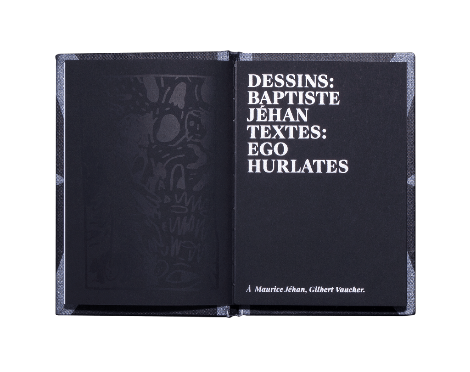
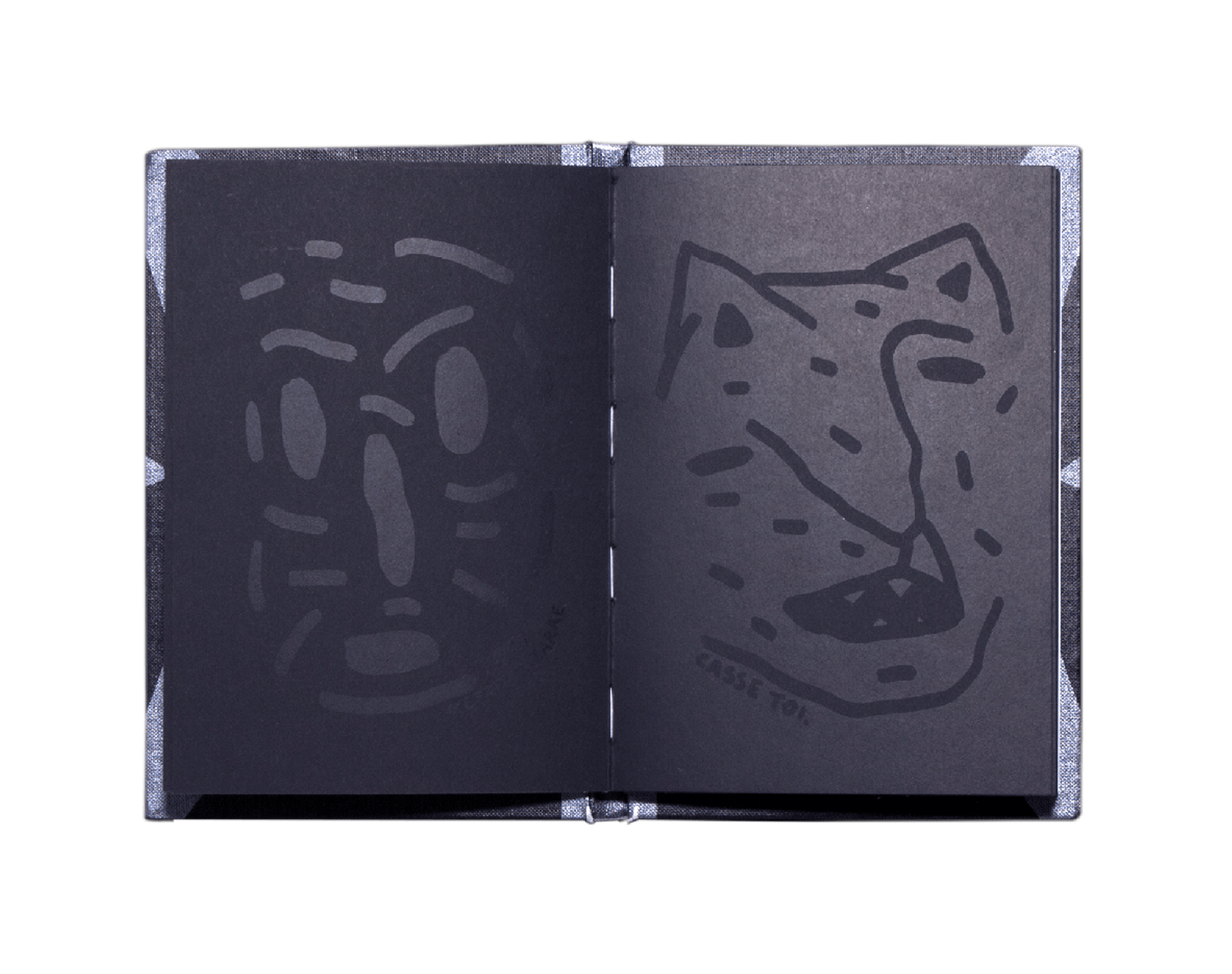
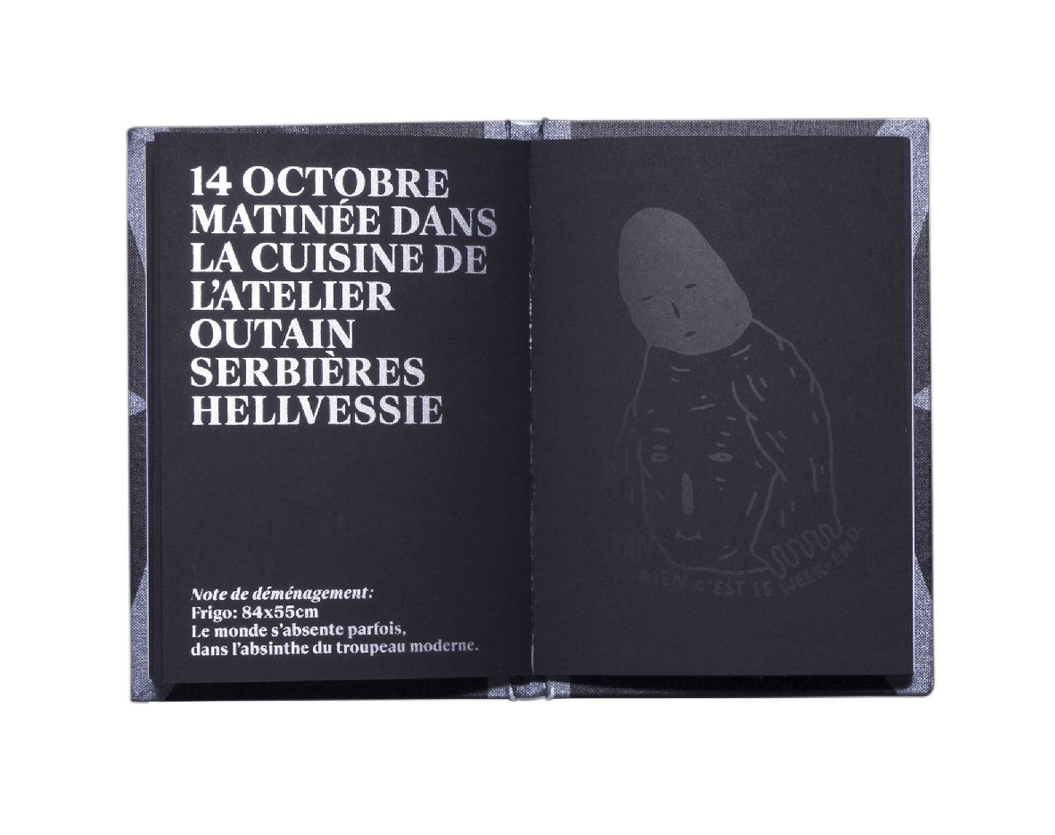
Adieu
Baptiste Jéhan
Ego Hurlates
2018
Editorial
Photography
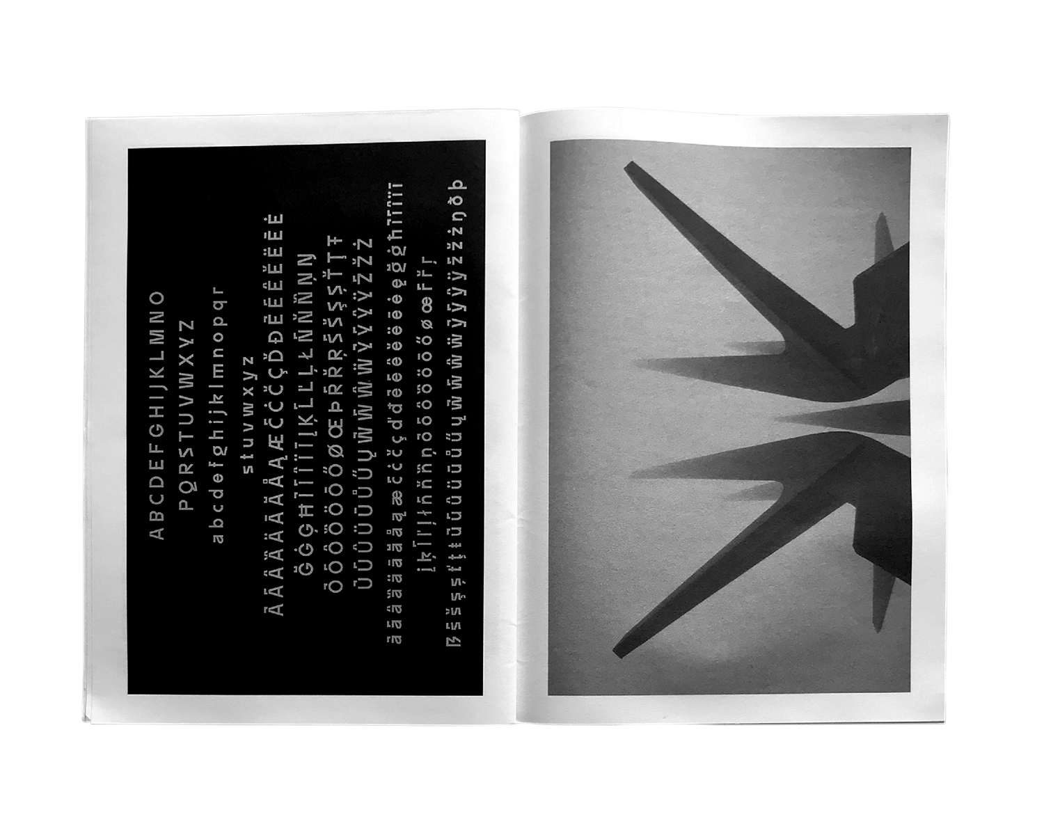
Neograd sans
Neograd Specimen
NORT

2018
Editorial
Other
Neograd sans
Shaping the Future
A New Residency
Le Cabinet-SR:CH

2017
Editorial
Sound
Benga Music
Flee Project
2017
Editorial
Poster
Other Side
Le Cabinet-SR:CH
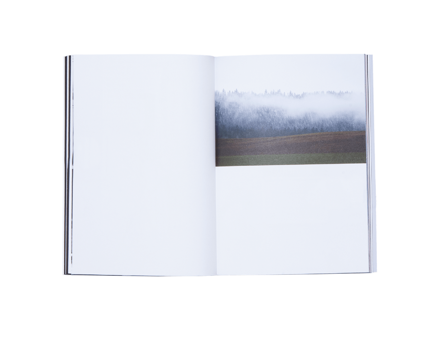
2017
Editorial
Photography
Diane
Giona Mottura
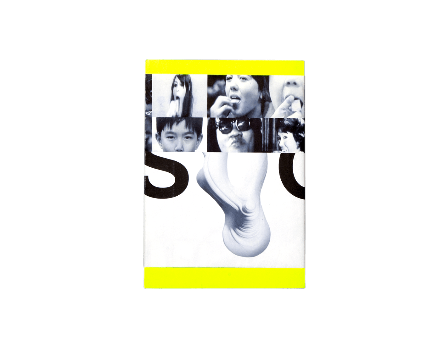

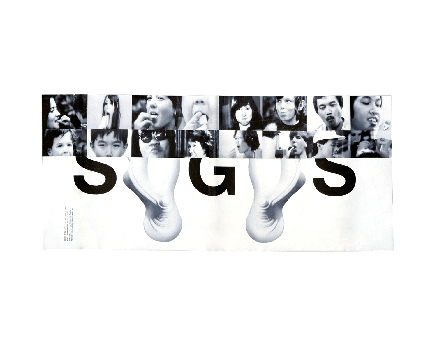
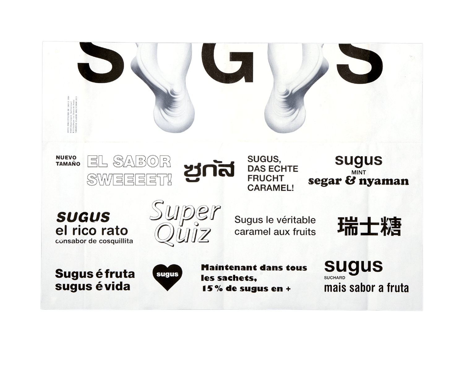
2013
Editorial
Other
Sugus Typework
Hochschule der Künste Bern
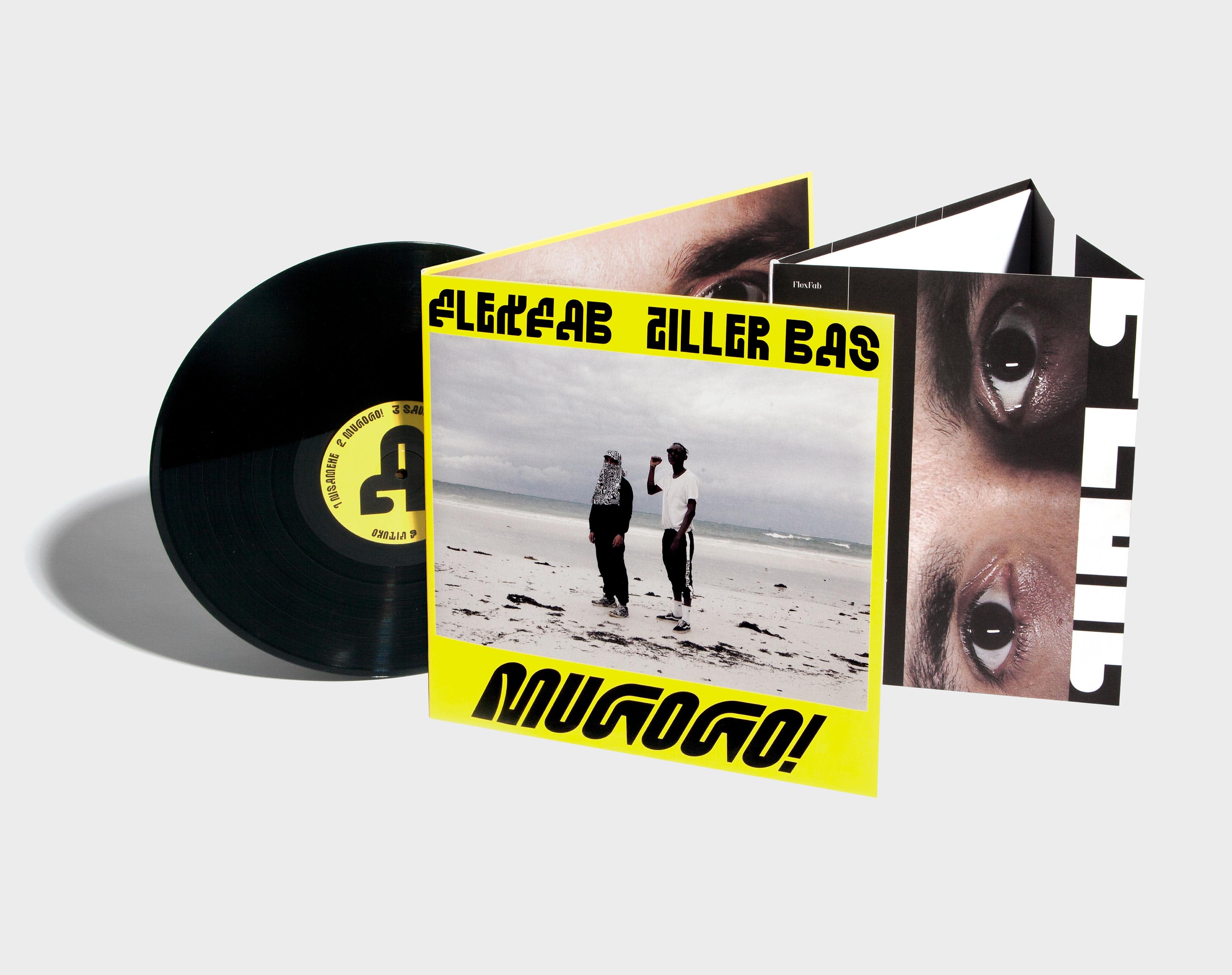
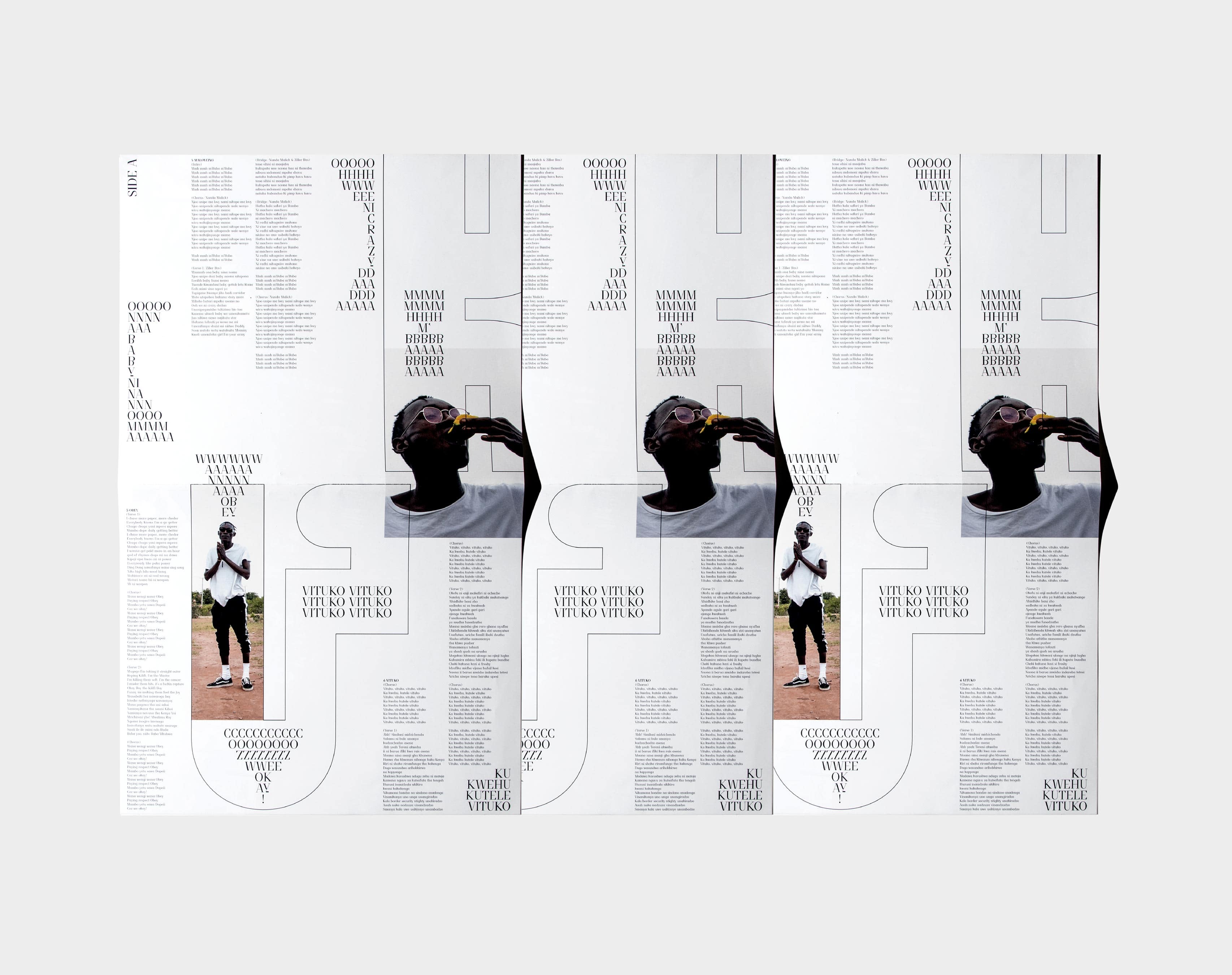
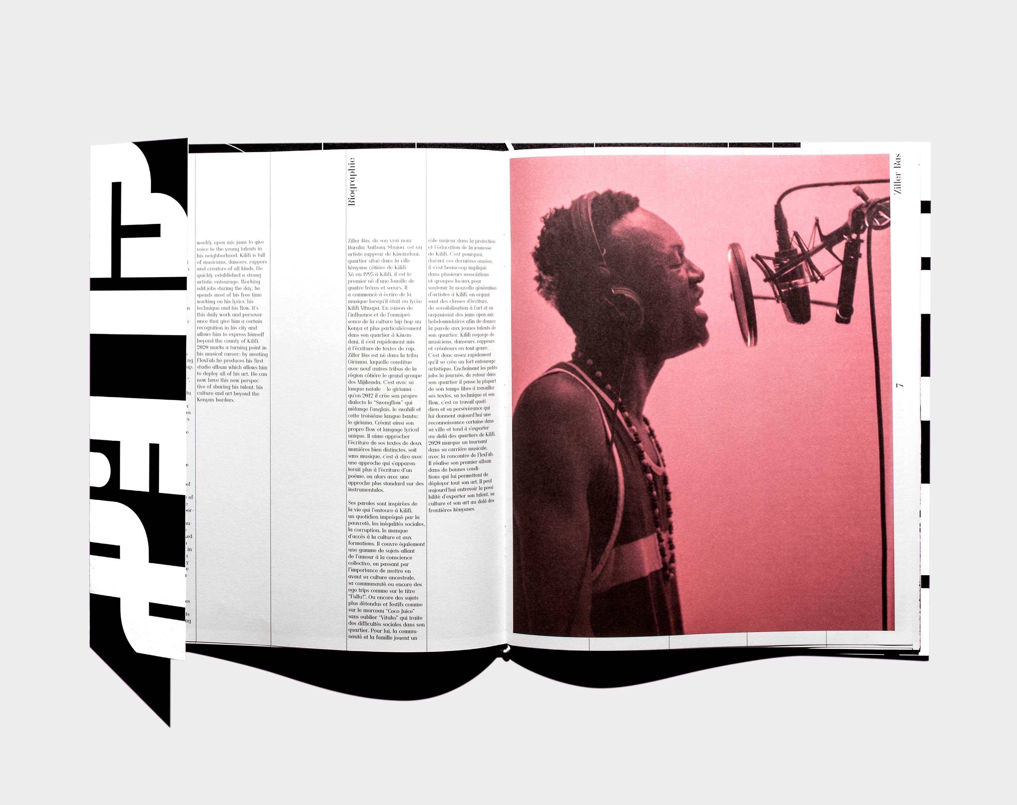
2022
Editorial
Sound
Neograd Didot
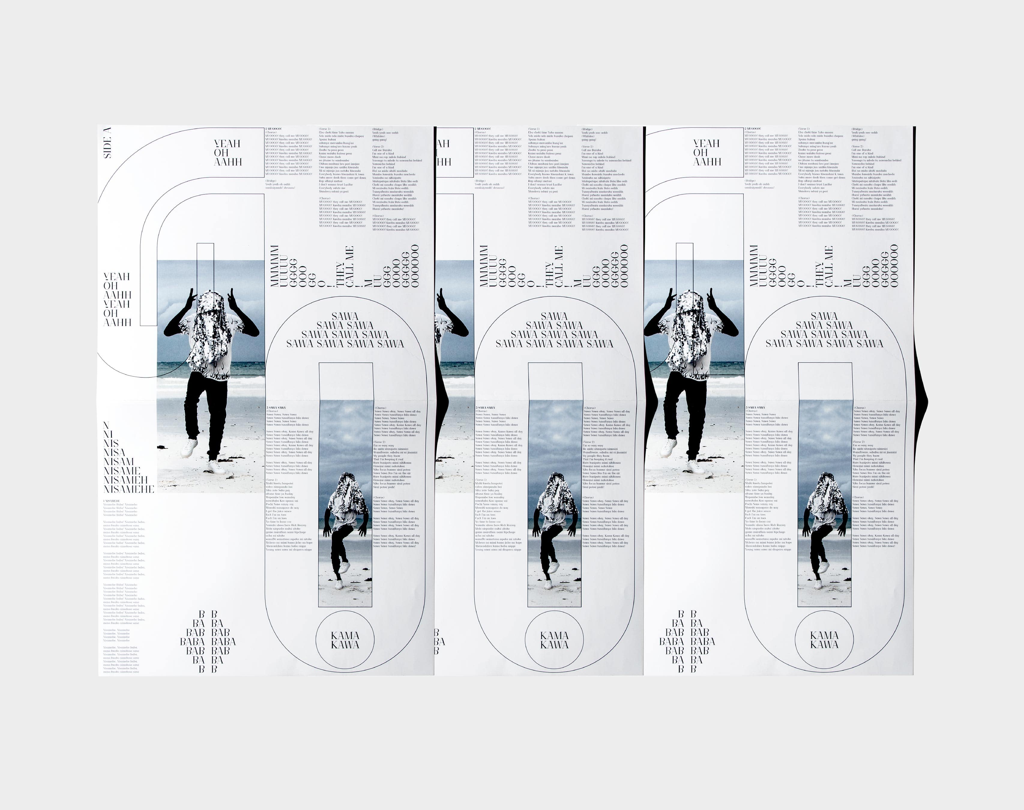
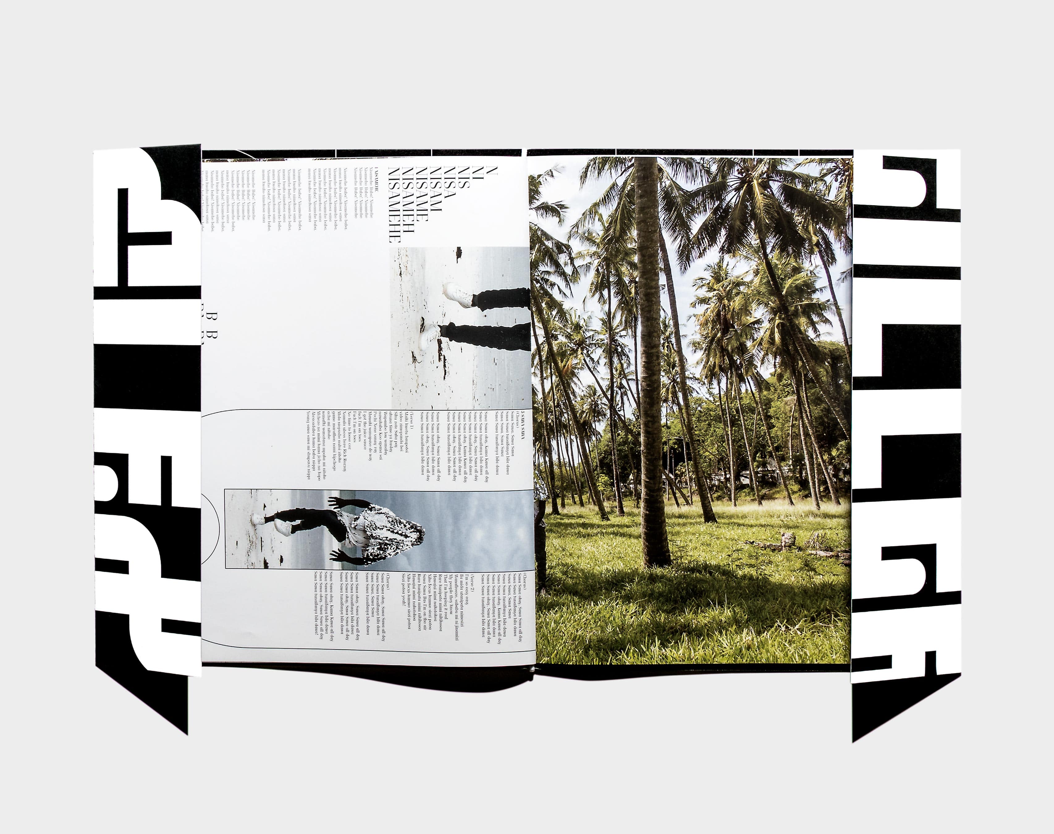
Mugogo
FlexFab
Ziller Bas
245 x 295 mm
Offset
Typeface:
Neograd Didot by NORT
Pickle Standard by bb-bureau
Art Direction by Théophile Glauser
Texts by Carl Ahnebrink, Raphaël Piguet, FlexFab & Ziller Bas
Published as part of the musical project Mugogo / Flexfab & Ziller Bas.
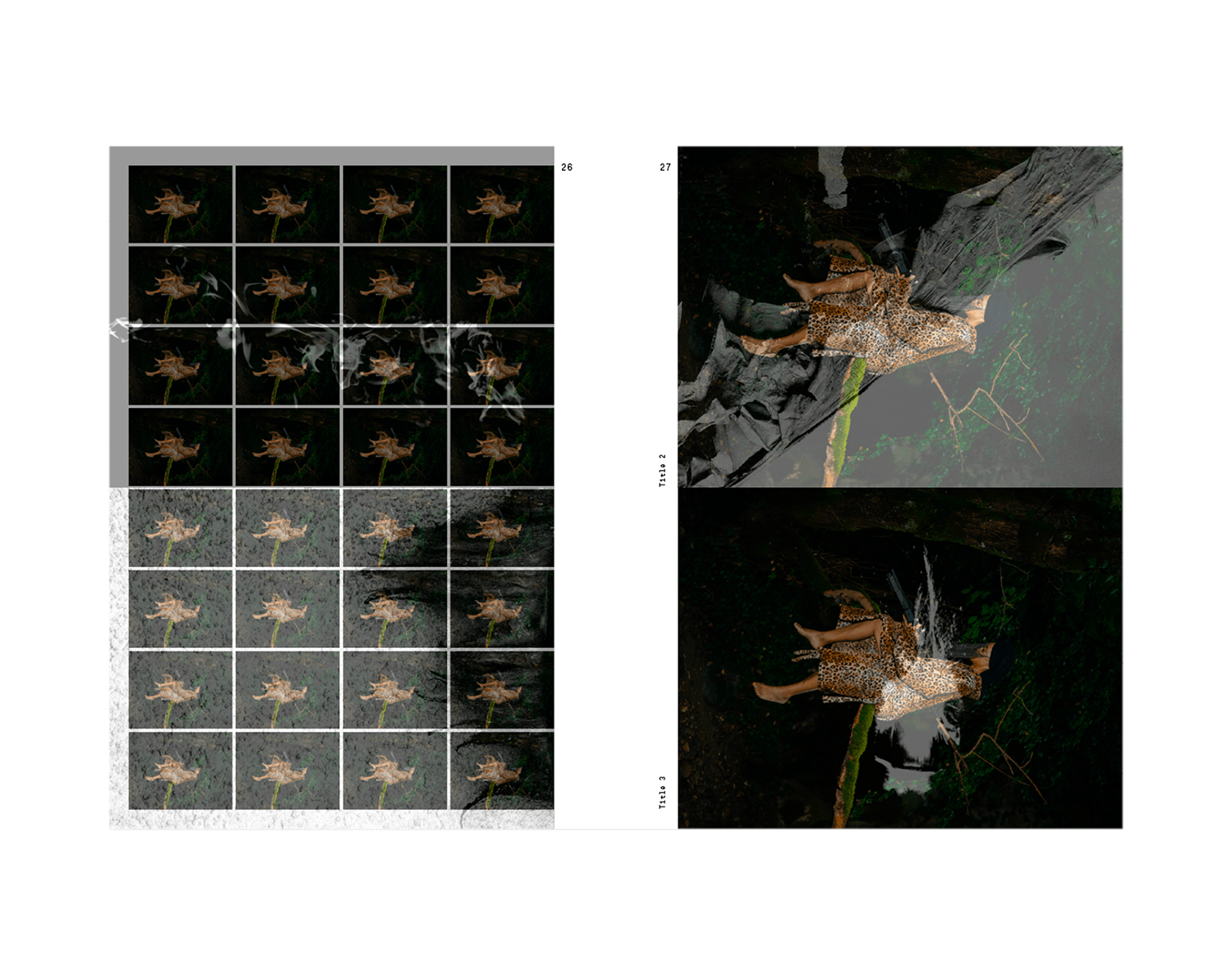
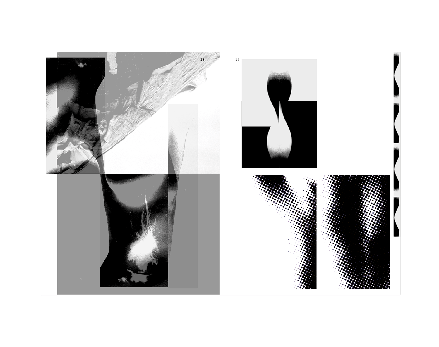
2021
Art Print
Editorial
Photography
Autopsie d’un accident
Guillaume Perret
Théophile Glauser
230 x 310 mm
Offset
Silkscreen
Typeface:
Nort mono
by Quadraat / NORT
Pictures by Guillaume Perret
Art Direction by Théophile Glauser
Project management by Sébastien Doutaz
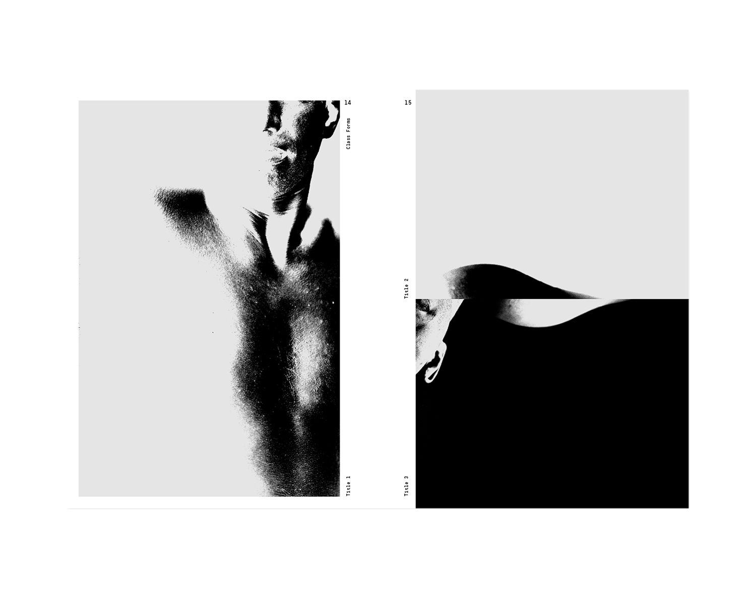
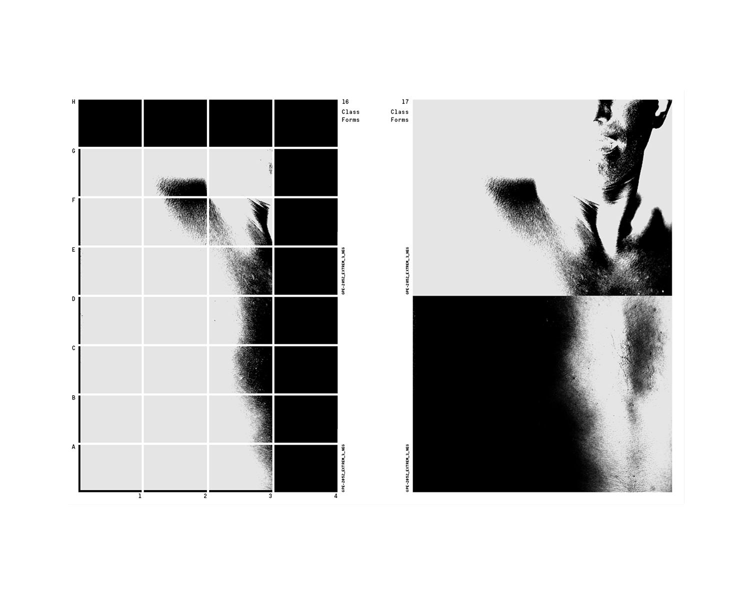
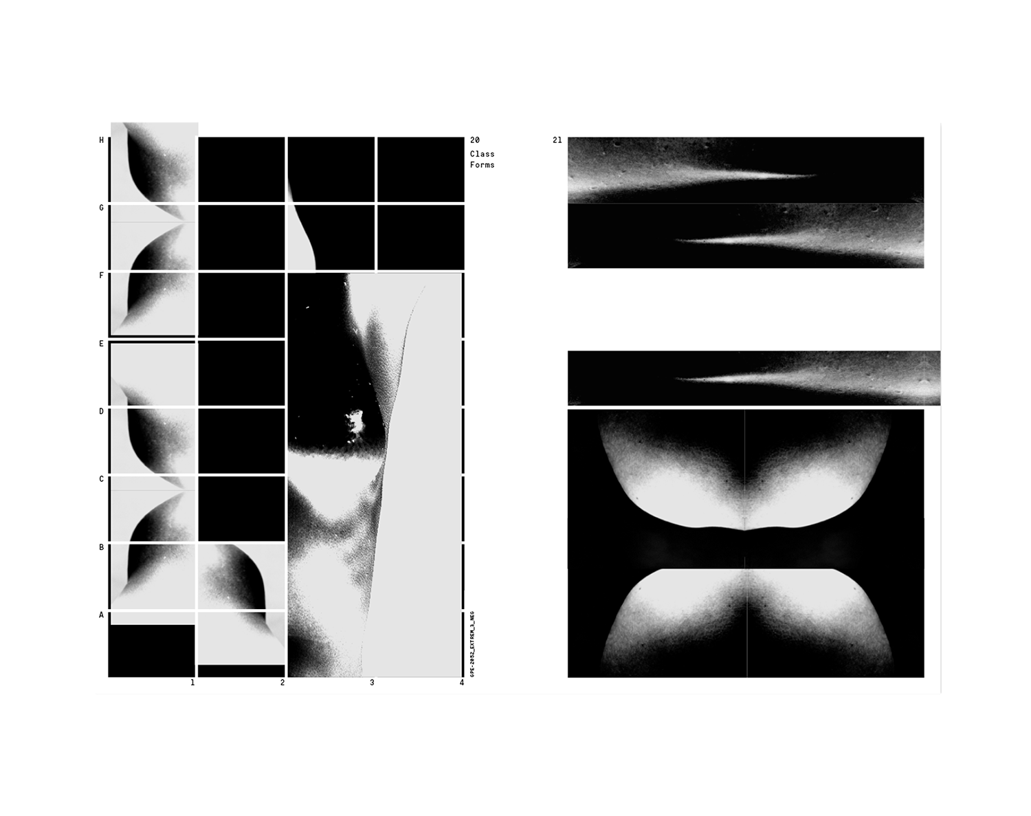
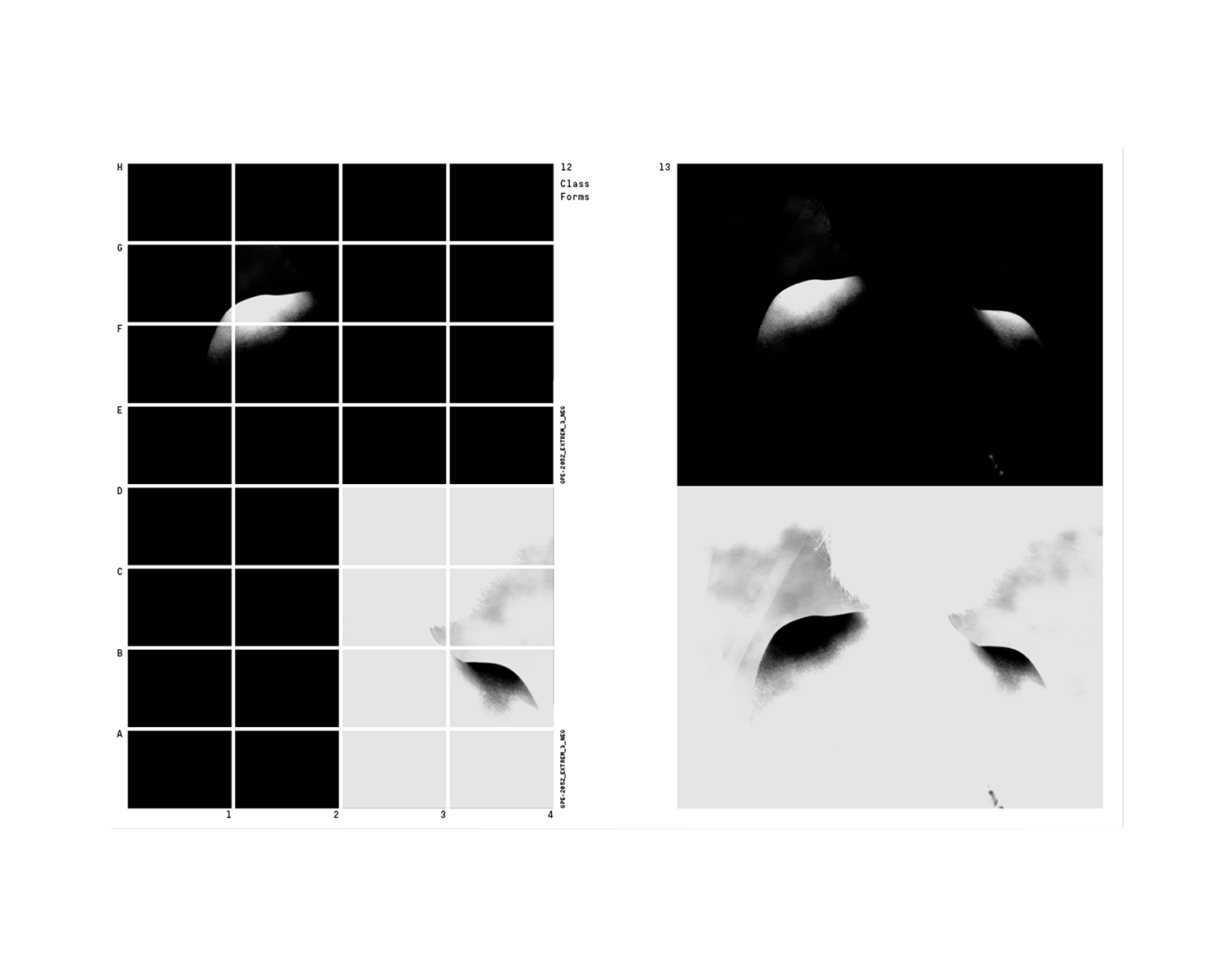
Research award granted by the canton of Neuchâtel in collaboration with the swiss photographer Guillaume Perret (Work in progress).
2021
Editorial
Identity
Poster
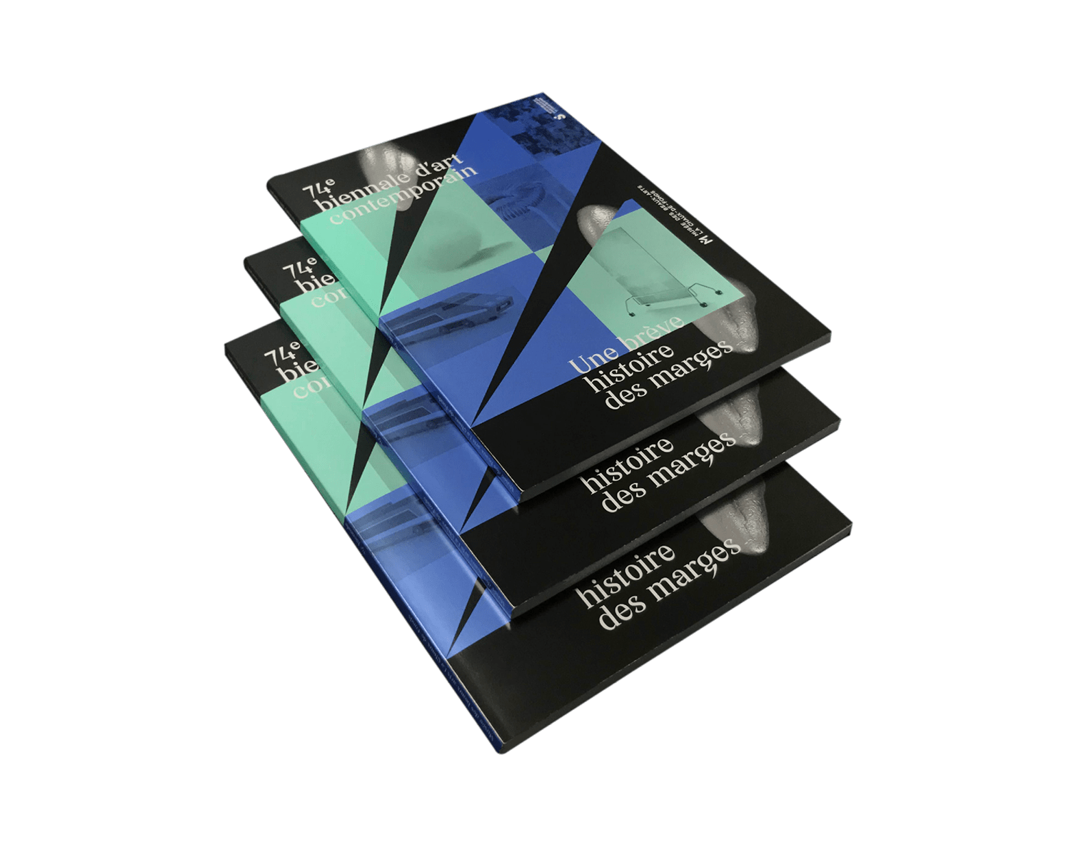
74e Biennale
Musée des beaux-arts
La Chaux-de-Fonds
173 x 235 mm
84 pages
Offset
Typeface:
Zermat
by Quadraat / NORT
Design by Théophile Glauser
Project management by Sébastien Doutaz
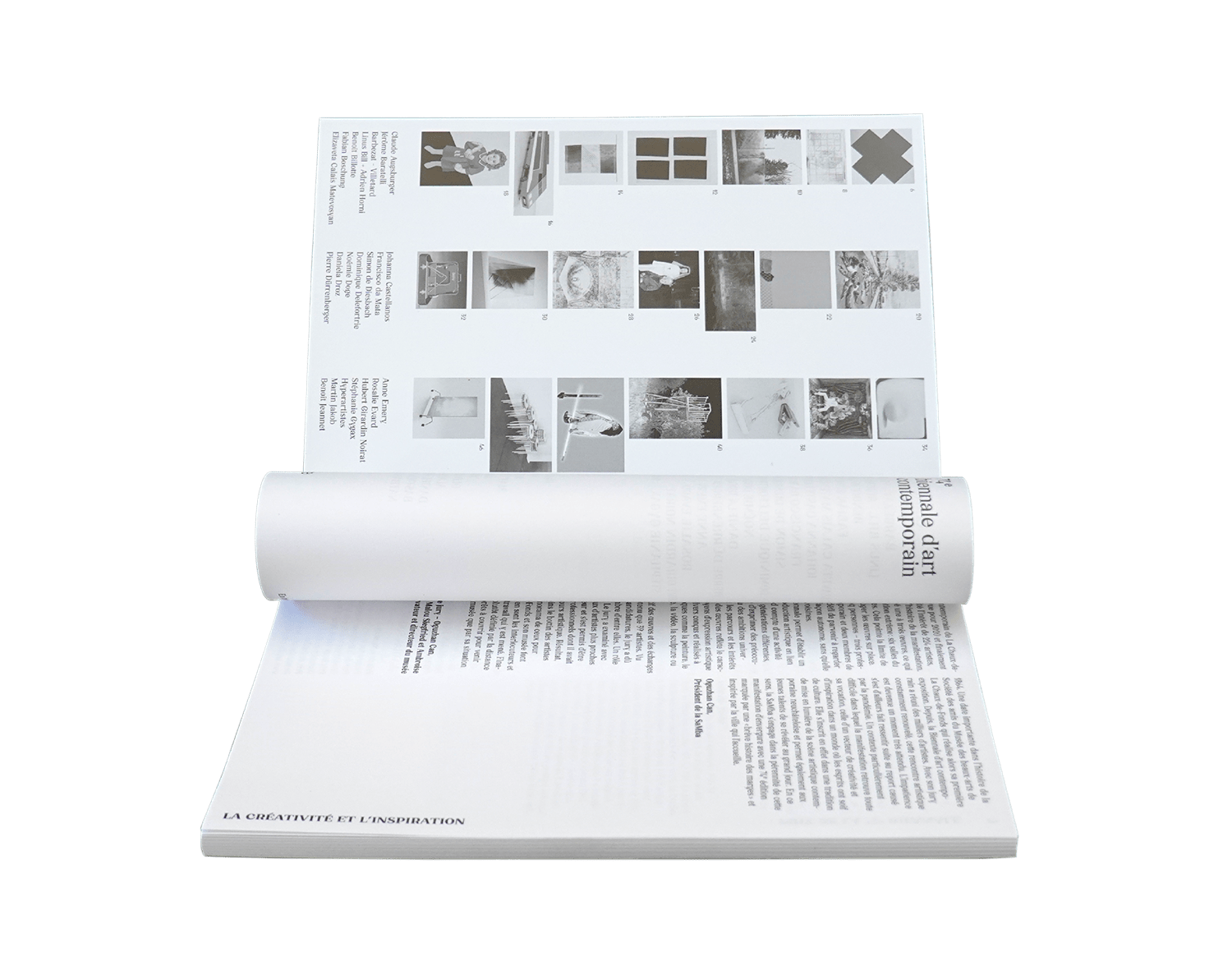
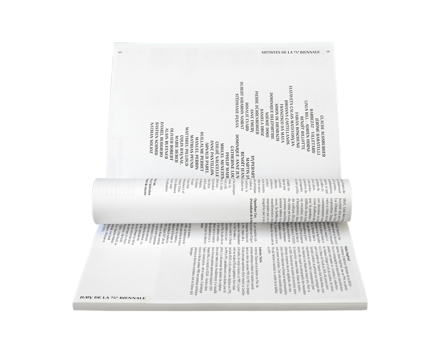
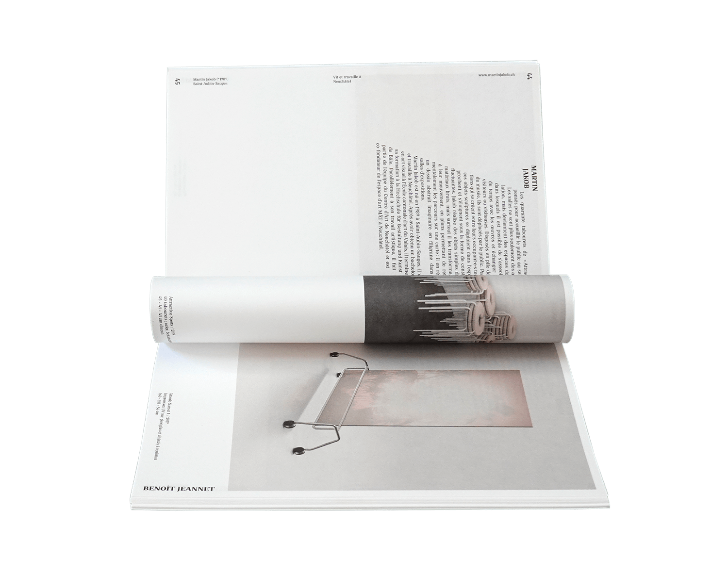
Published as part of the 74e biennale d’art contemporain, Musée des beaux-arts de La Chaux-de-Fonds, une brève histoire des marges.
2020
Editorial
Sound
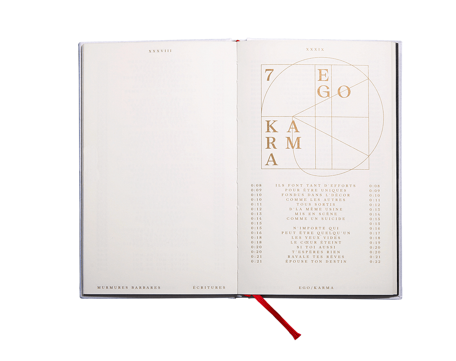
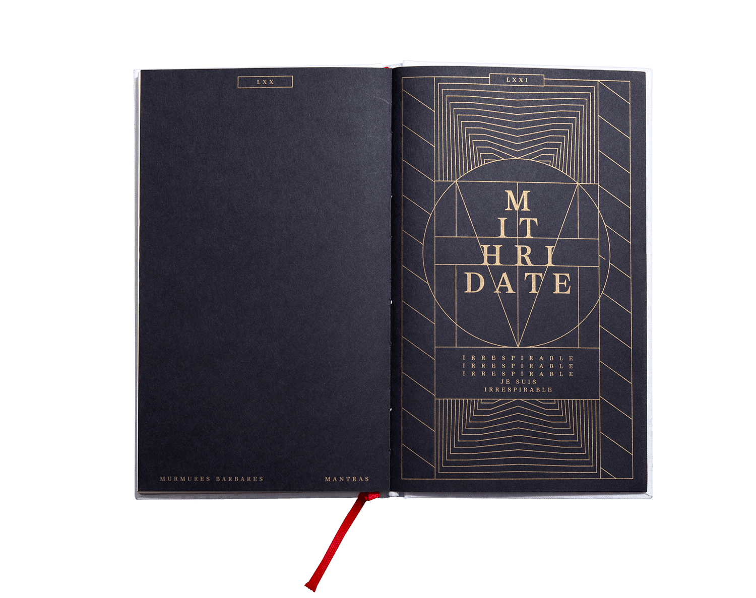
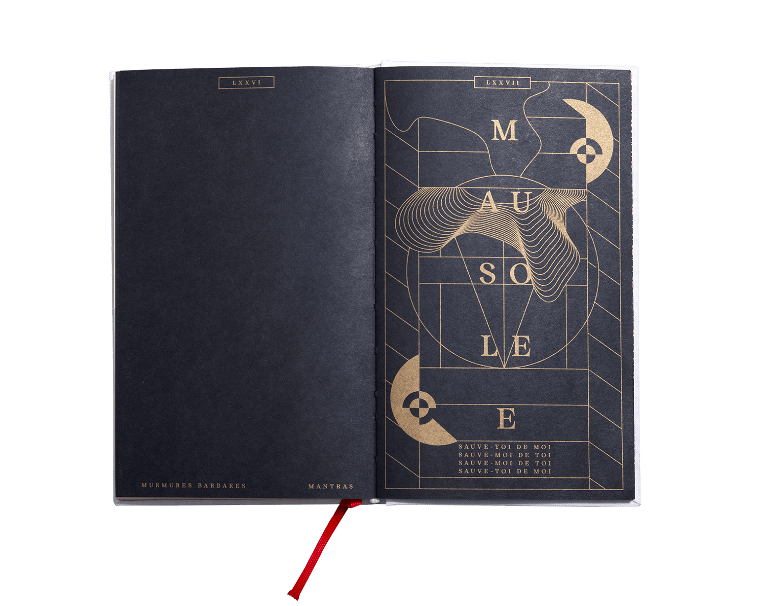
MB New Religion
Mantras
Murmures Barbares
120 x 197 mm
88 pages
Offset, hot foil, gold leaf
Typeface:
MB New Religion
by Théophile Glauser / NORT
Artwork by Théophile Glauser
Project management by Sébastien Doutaz
Images by Raphaël Piguet
Published as part of the musical project Mantras / Murmures Barbares.
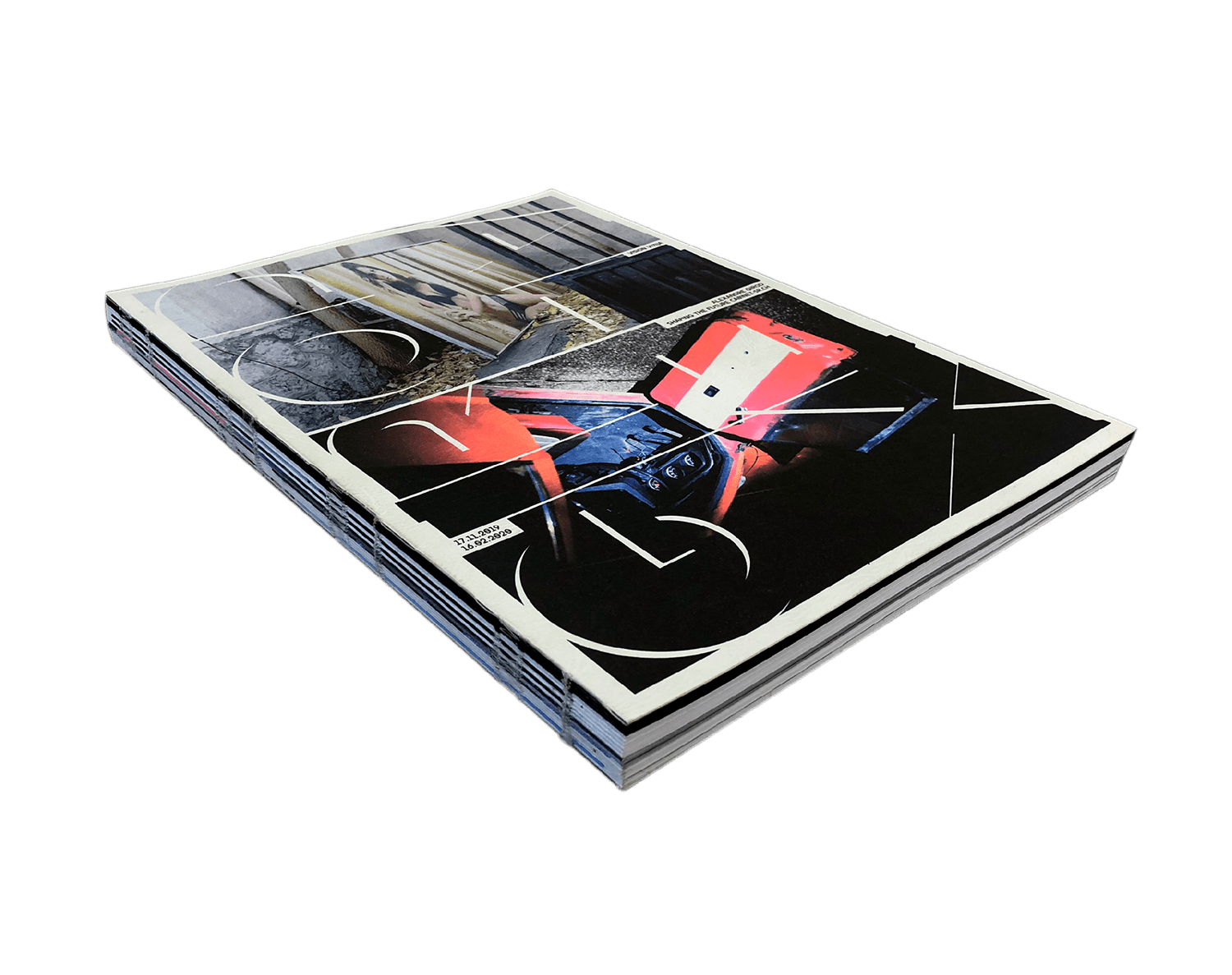
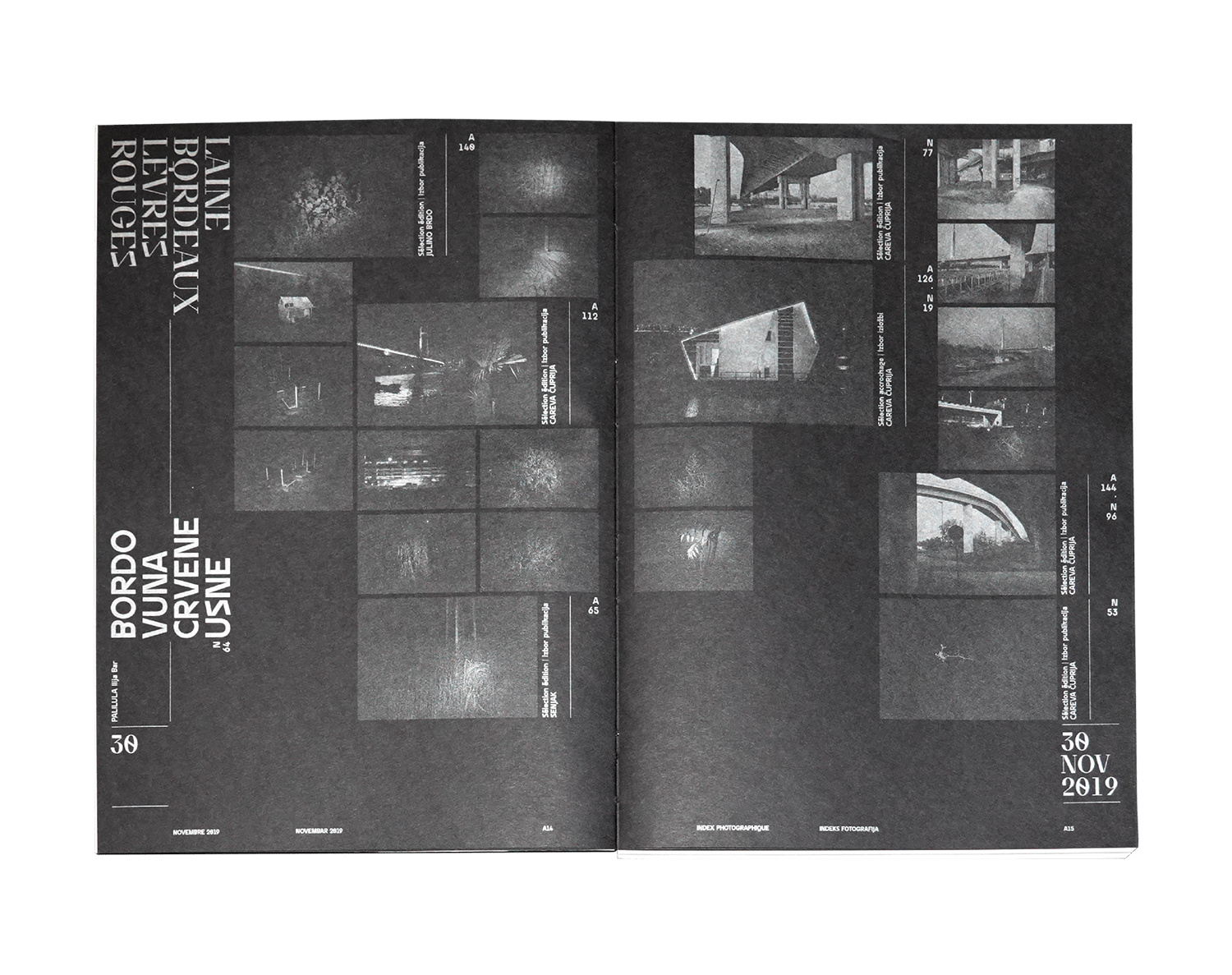
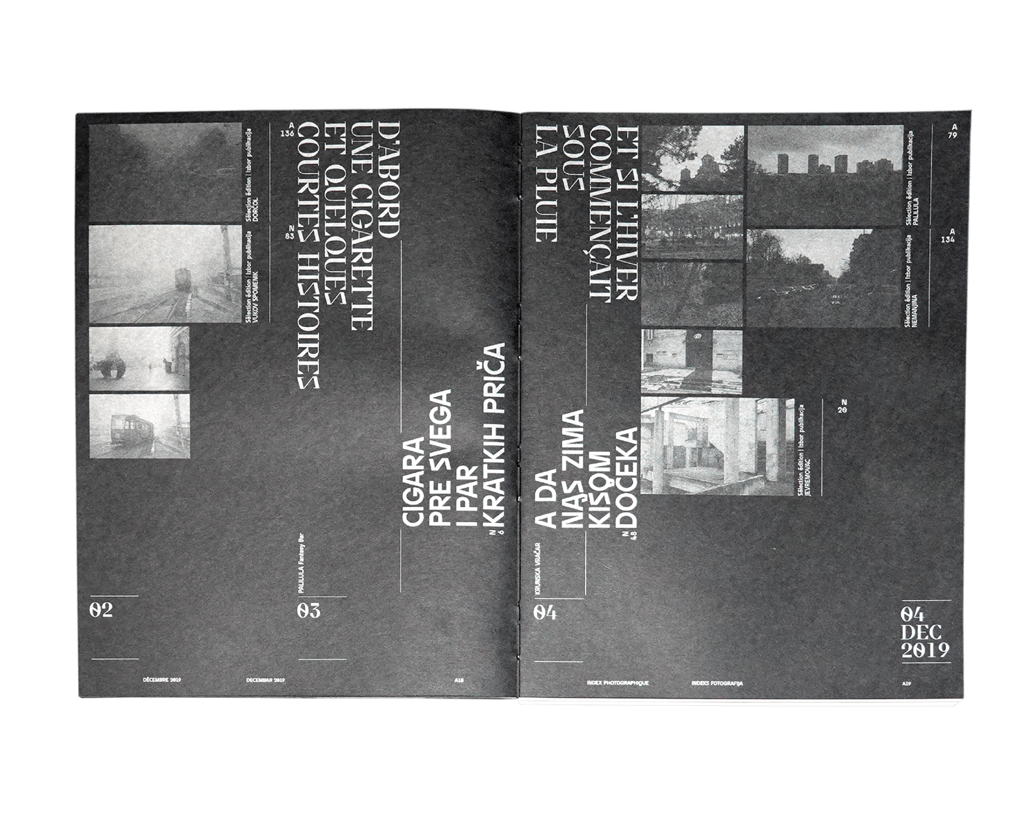
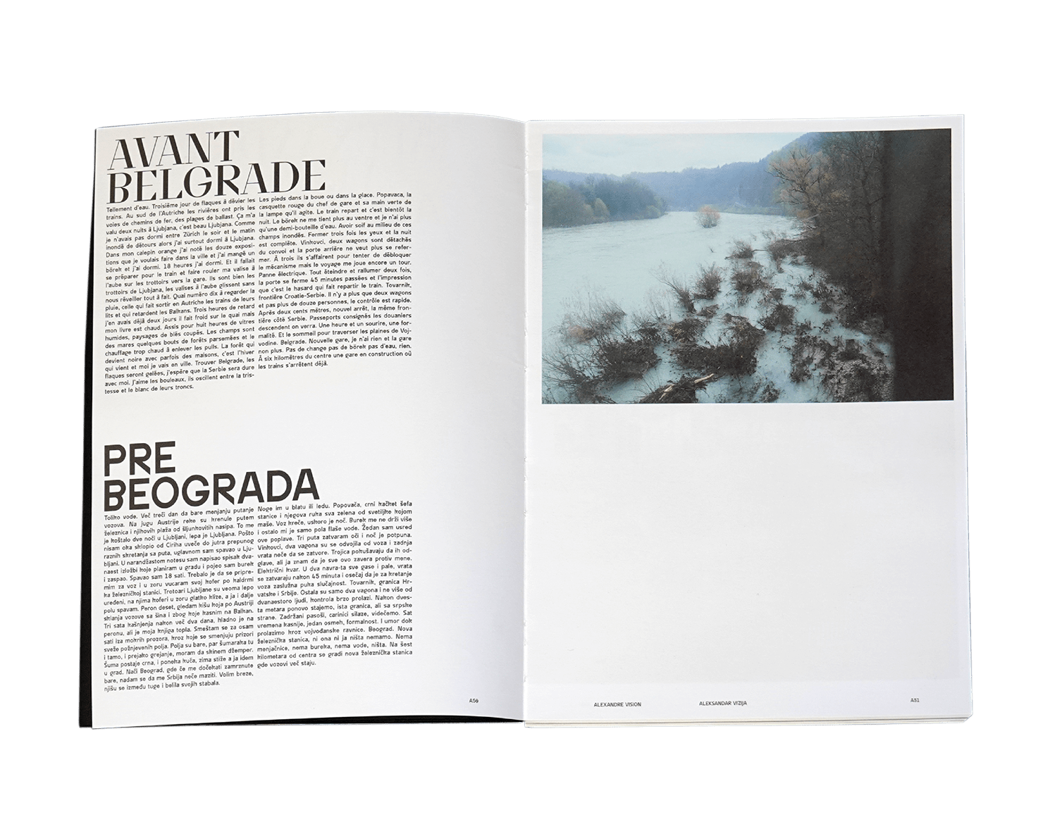
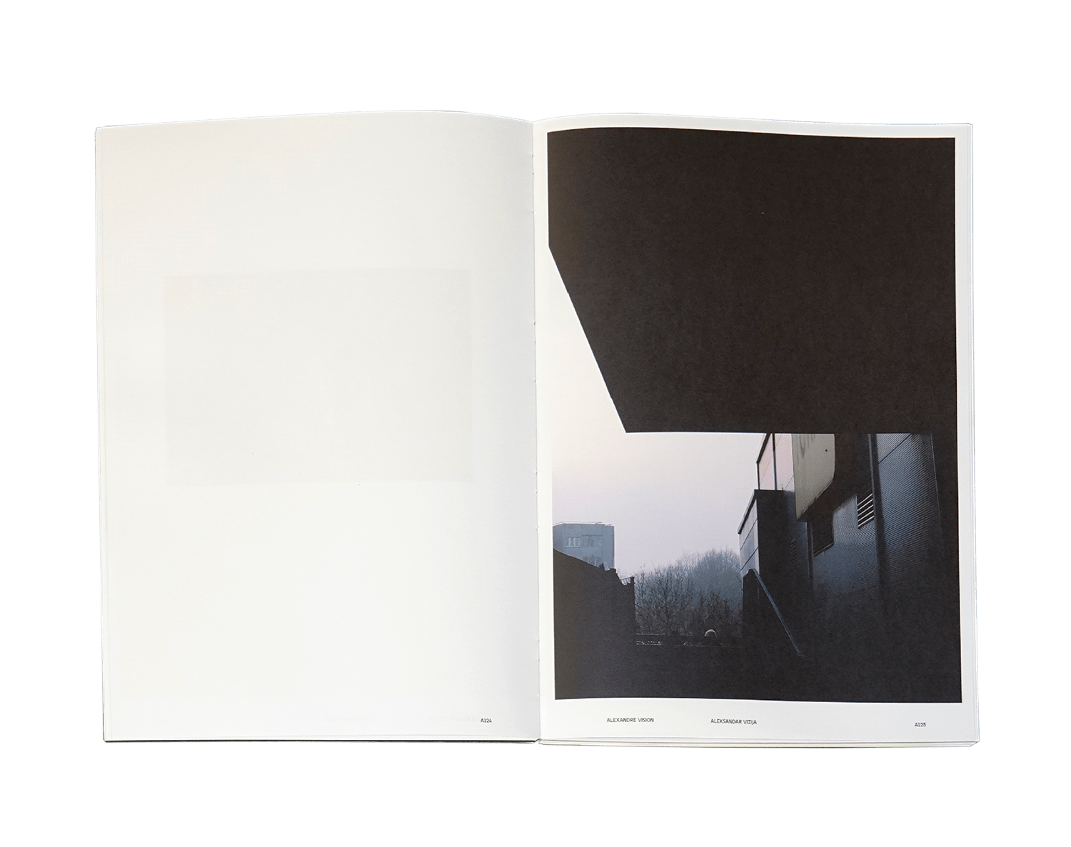
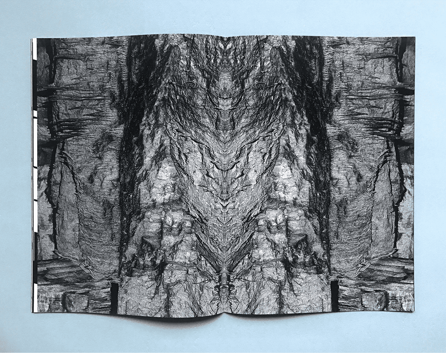
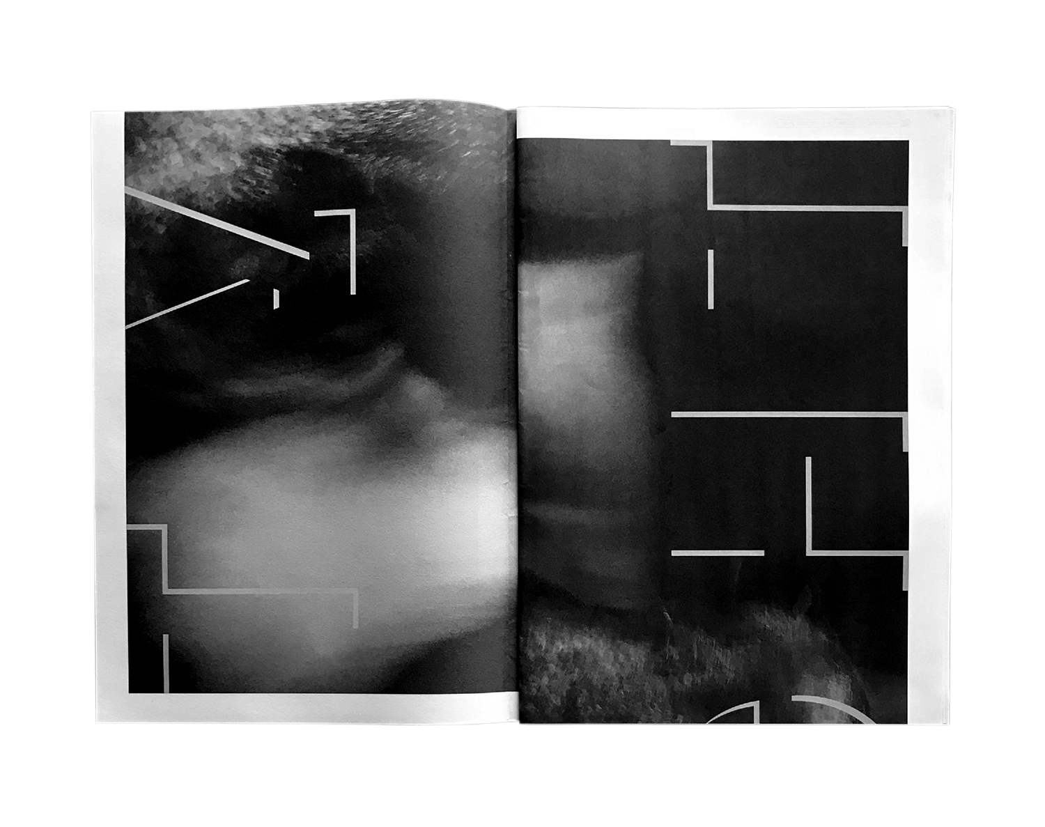
Photographic work and writing. Pictures and texts meet and seek each other, sometimes in a documentary form, sometimes using suggestive parables. The role of the various mediums are not compartmentalized in one or other of the given forms. Interrogations on the urban structure and its representations. Games of mirrors between formal findings and poetic essays, it’s a question of creating bridges between the collective imagination of the people and their social realities. Rather than the Balkans, it’s Belgrade. This city, which he met twice, a first time a few weeks after the end of the NATO bombings in 1999 and a second time in 2017. Two meetings, a curiosity and a nascent love. From its historical past to destructive reconstructions, the chaotic energy of the East, the melancholy of forgotten grandeur, the pride of the rivers, and the story to be rewritten incessantly, the walls of the white city are hypnotizing. It’s about this state of permanent grace, about that sadness of violin and about this dawn falling on its pavements, its concretes, as sunlight vapor. It’s about water that shines its docks, about those who live, pass or survive, about those who buy in oil the soon cosmopolitan Sava, about these worlds which cross between the night and the day that Alexandre Girod want to speak, write and render image. After 3 months in the white city, the swiss photographer will present you his work through exhibition and book designed by NORT. A book that can begins from the first page as well as the last. This duality then meets at its center, at the crossroads of the stories told by the authors. A unique dramaturgy, narrated by image and text according to a strong editorial concept which exploits an iconography with bold and carefully chosen lines of force.
2020
Editorial
Photography
Neograd
Vision Vizija
Alexandre Girod
NORT
227 x 315 mm
288 pages
Offset
Typeface:
Neograd Sans,
Neograd Didot by NORT
Design by Théophile Glauser +
Raphaël Picard & Julien Métille (Quadraat)
Pictures and texts by Alexandre Girod
Published as part of the residency and exhibition Vision Visija, Ostavinska gallery, Belgrade (RS). Powered by Le Cabinet-SR:CH.
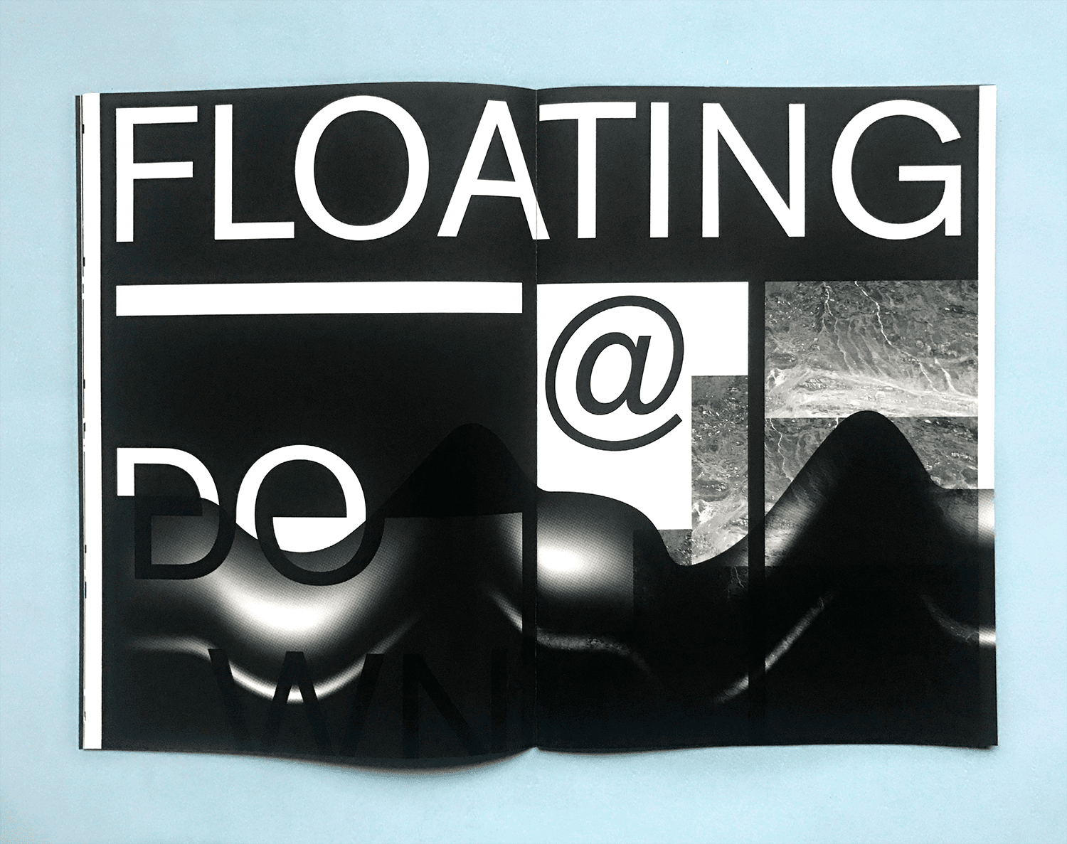
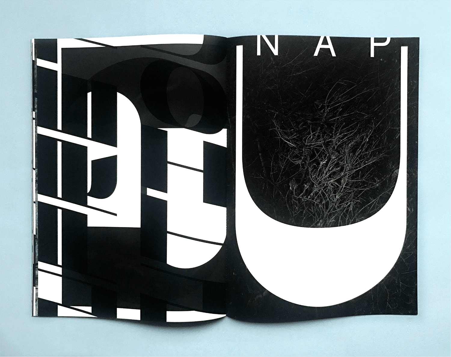
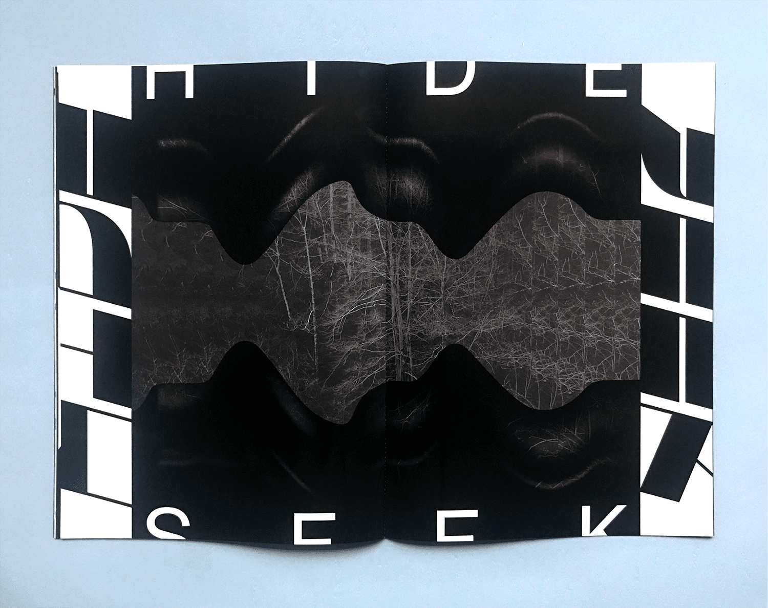
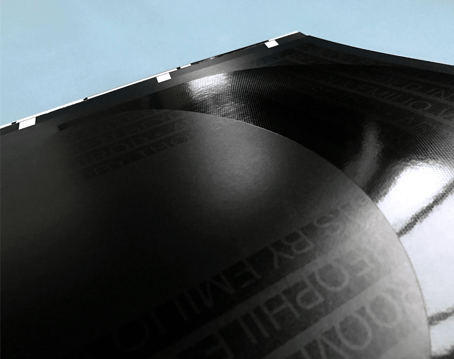
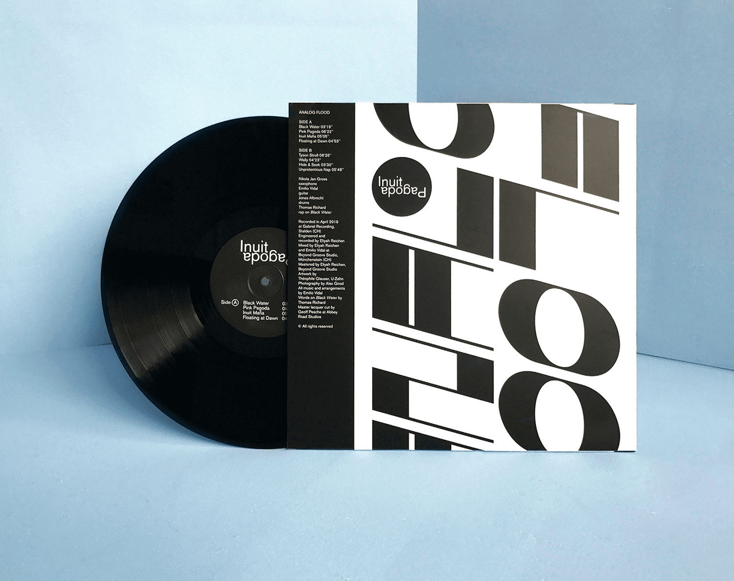
Inuit Pagoda is a Swiss-based trio comprised of saxophonist Nikola Jan Gross, guitarist Emilio Vidal, and drummer Jonas Albrecht, that began developing experimental-afro-punk music in 2019. They recently released their debut album Analog Flood, and along with it, a booklet under the name Analog Flood created in collaboration with graphic designer Théophile Glauser. The graphic design process uses working methodologies related to sound development and explores the similarities in the compositions of the two artistic fields. The mixing process was fully analog and the tracks were mastered with tapes. Therefore we chose to print the booklet in offset and silkscreen. Both experimental processes provide texture and form depth to the project. The name Analog Flood has been jointly conceived by Emilio and Théophile and can refer to the evolving sounds layers that overflow in the music and describes the overall aesthetic. The definition of Flood is rather related to the way we printed: The sheets were more than completely filled with ink or varnish. The term Flood makes sense in both fields but it’s rather related to the concrete achievement. Analog reflects more the creation process. Analog Flood draws its visual sources from the North Pole, in the ice, under the sea with a spiritual detour in a distant pagoda! Mystic visuals are inspired by many cultures. The architecture of the Buddhist temples has been a basic element for the creation of the layout grid. The display font designed for the project takes its inspiration from the Inuit writing system. The marked difference between forms and counter-forms allows a game of composition with the pictures. Letters in compositions are positioned in such a way, that they are still readable while they become symbolic when they are isolated or when they are cut freeboard. The lyrics of the song Black water have found their place in the iconographic world of Alexandre Girod: Hello, north pole, freeze my skeleton, Soft skin, cold breeze, icy venom Below sea surface I hear sirens, Calling sailors, dive in, silence…
2019
Editorial
Sound
Black Water
Analog Flood
Inuit Pagoda
300 x 420 mm
20 pages
Offset + Silkscreen + Embossing
Typeface:
Black Water
by Théophile Glauser / NORT
Akzidenz-Grotesk / H. Berthold
Design by Théophile Glauser
Pictures by Alexandre Girod
Published as part of the musical project Analog Flood / Inuit Pagoda.
2019
Art Print
Editorial
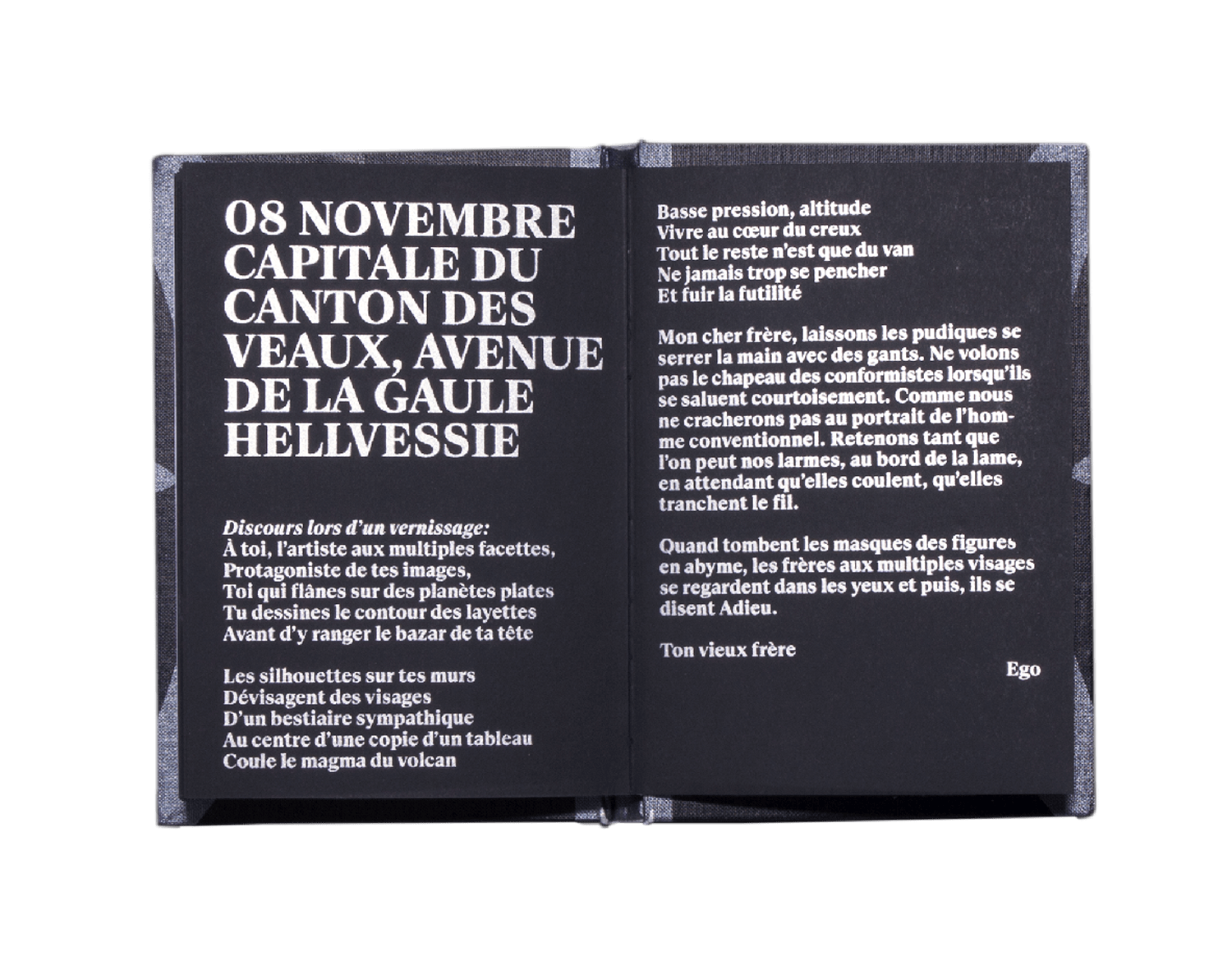
Adieu
Baptiste Jéhan
Ego Hurlates
160 x 230 mm
64 pages
Silkscreen
Typeface:
Suisse Works
Artwork by Baptiste Jéhan
Design by Théophile Glauser
Print by U-Zehn
Published as part of the exhibition “Adieu” by the swiss artist Baptiste Jehan l'atelier café galerie, Lausanne (CH).
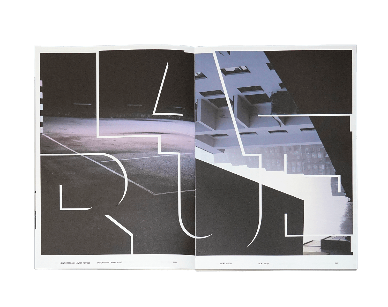
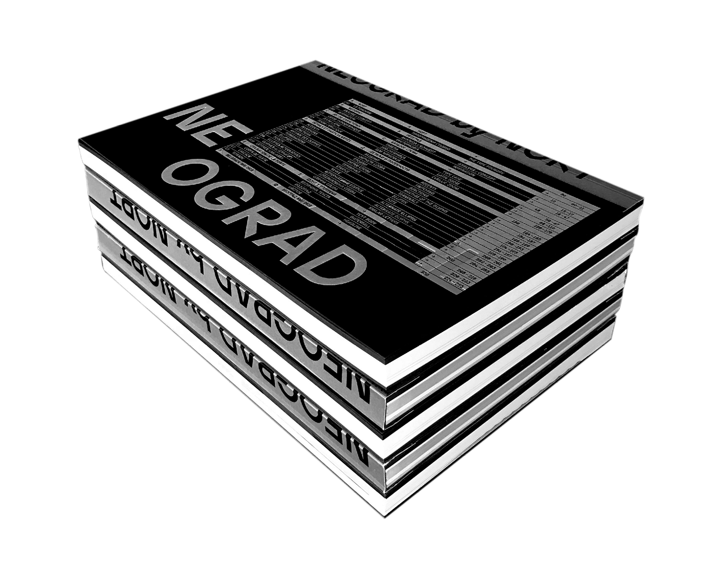
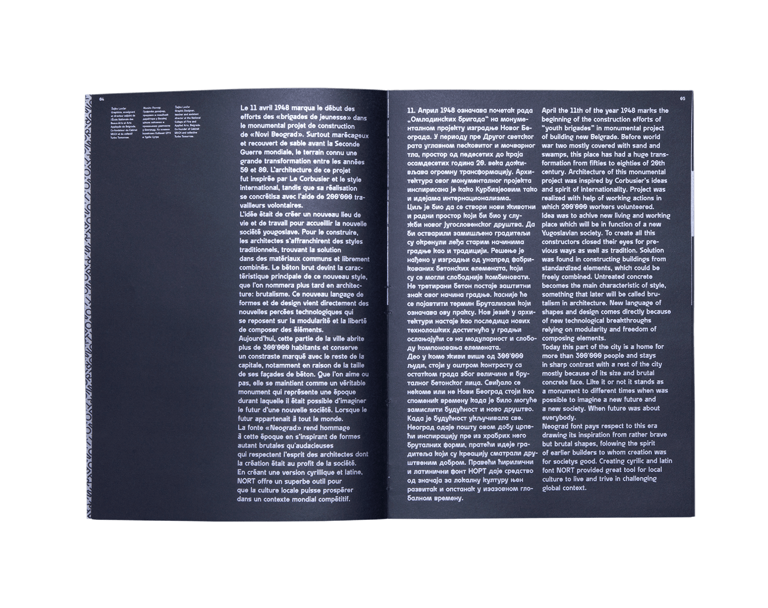
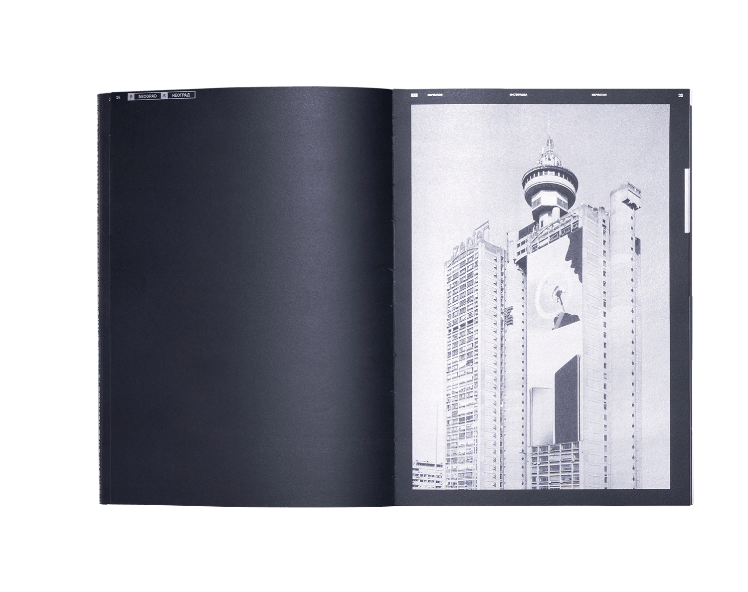
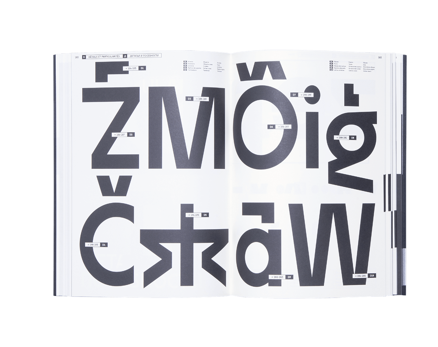
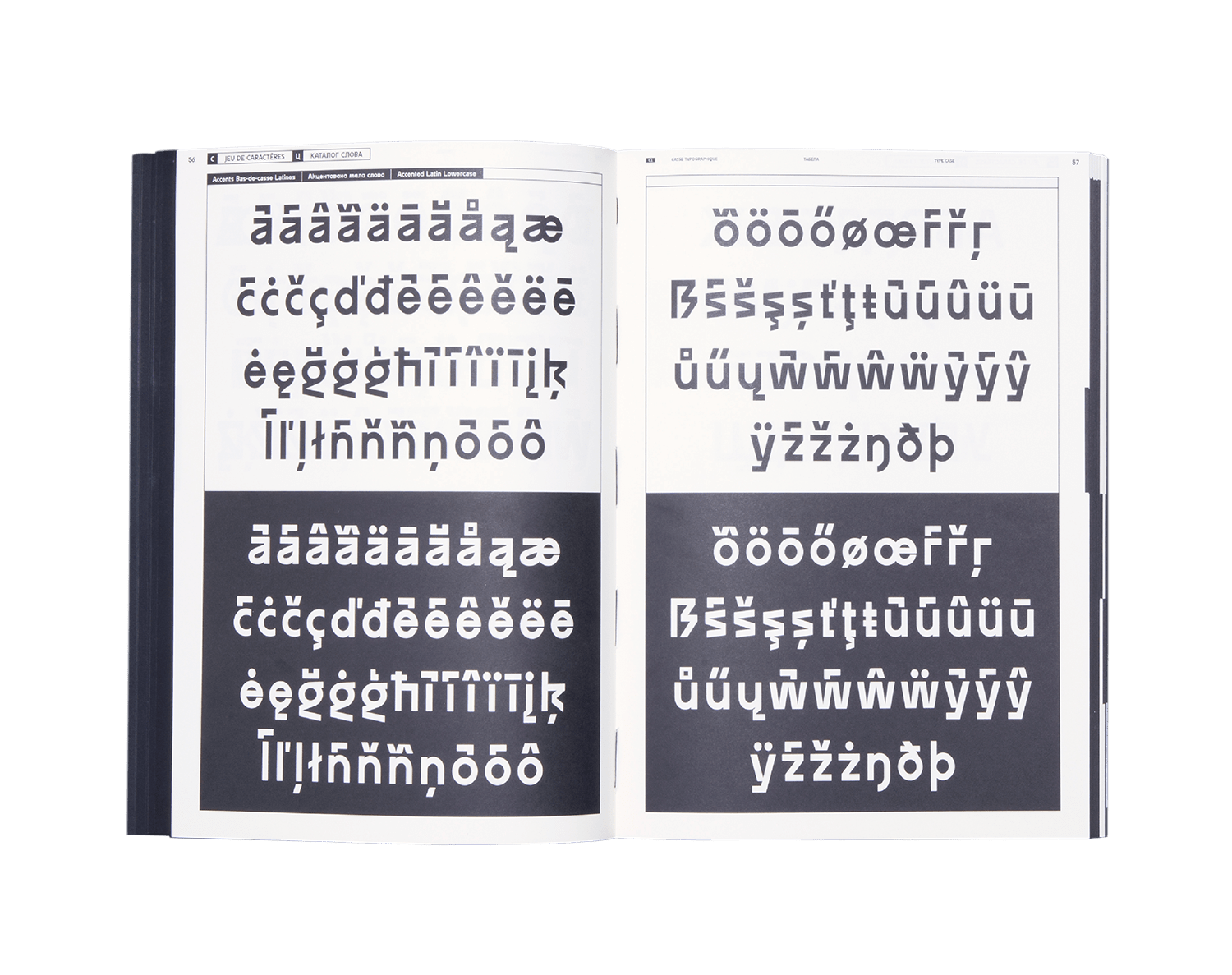
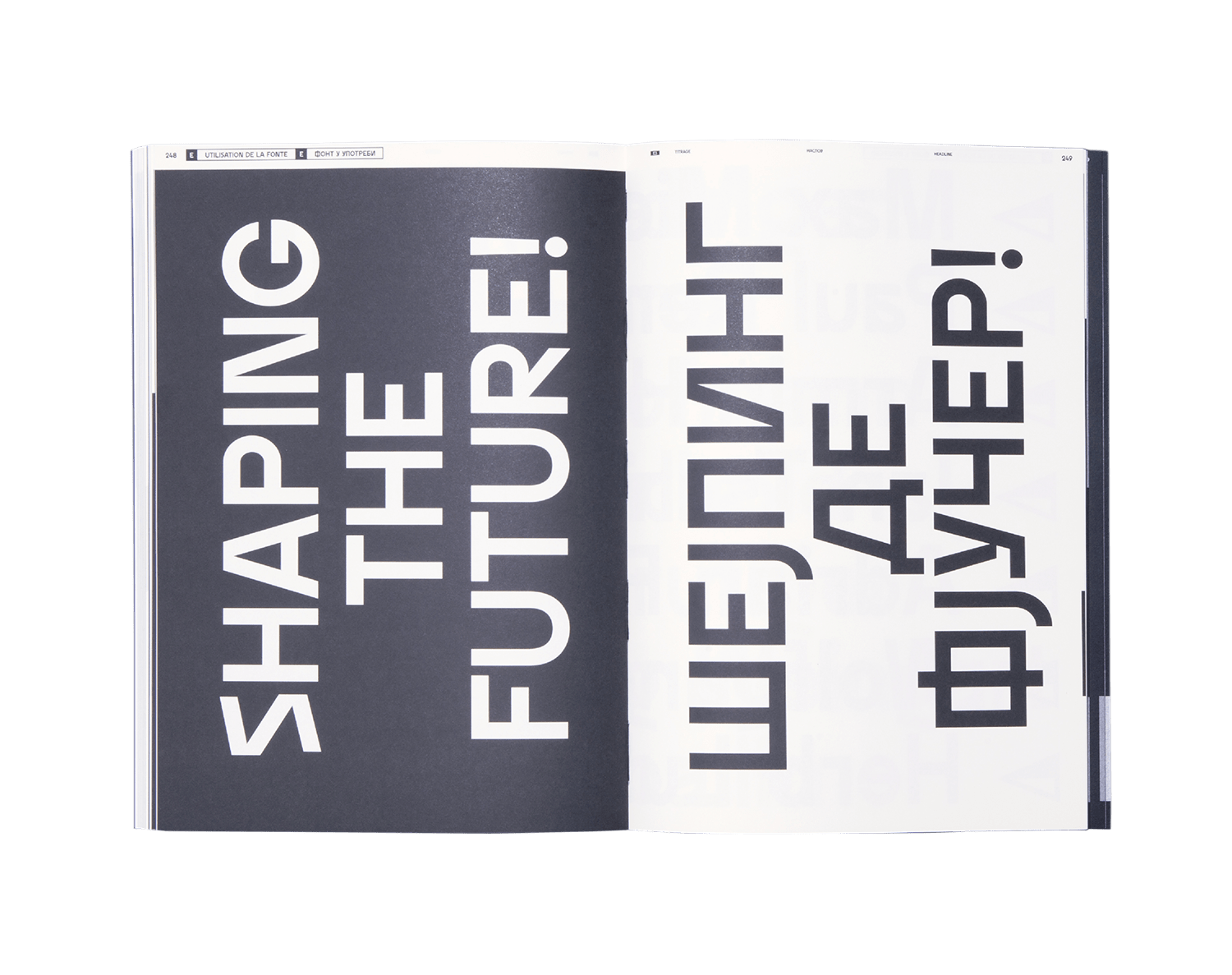
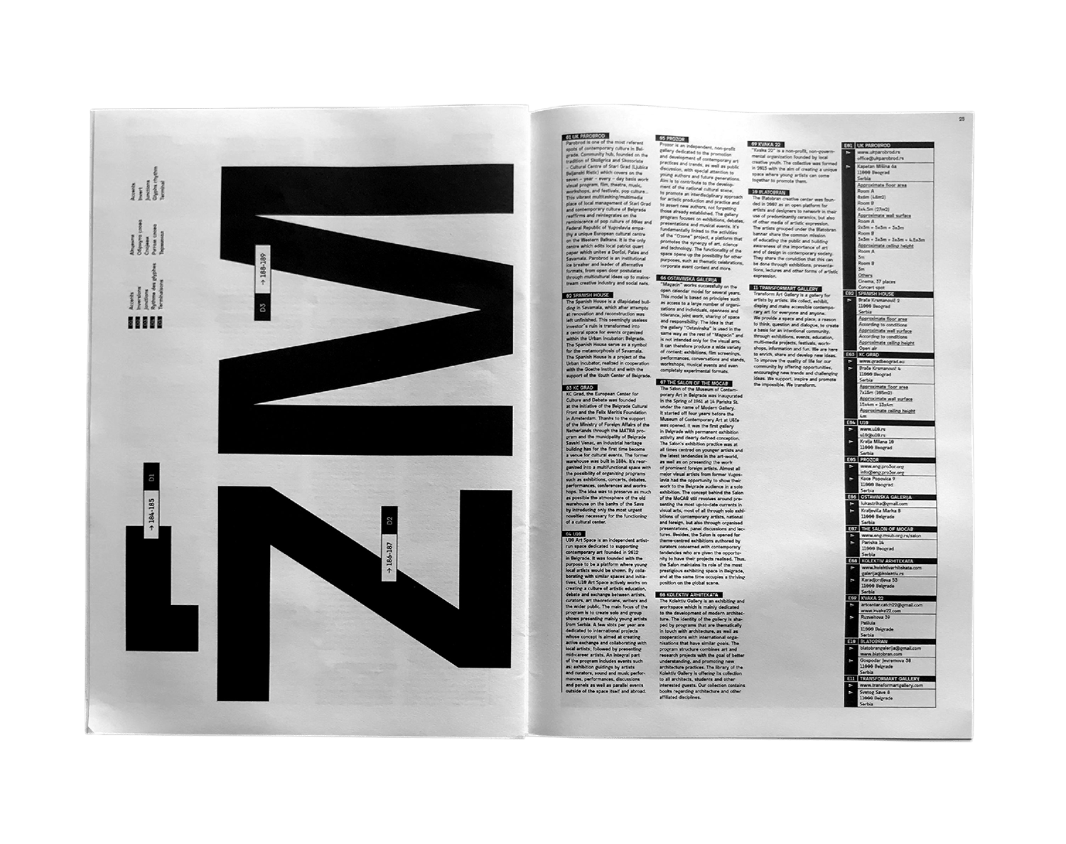
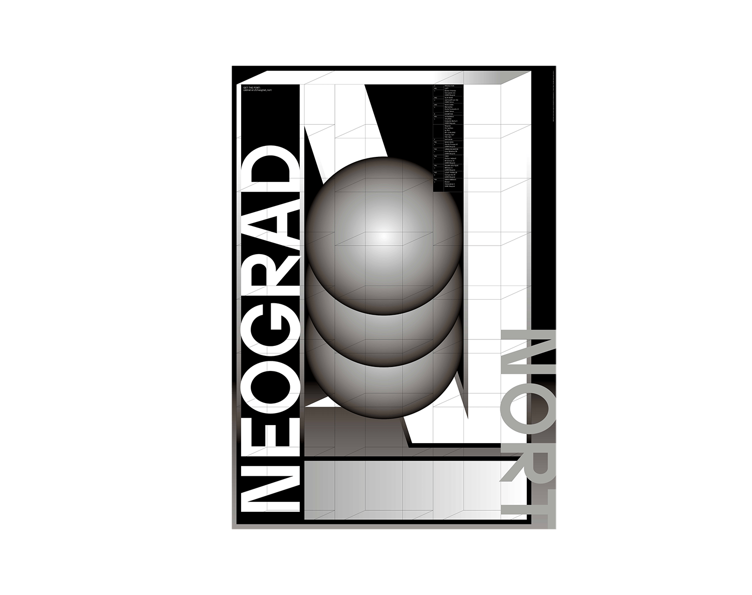
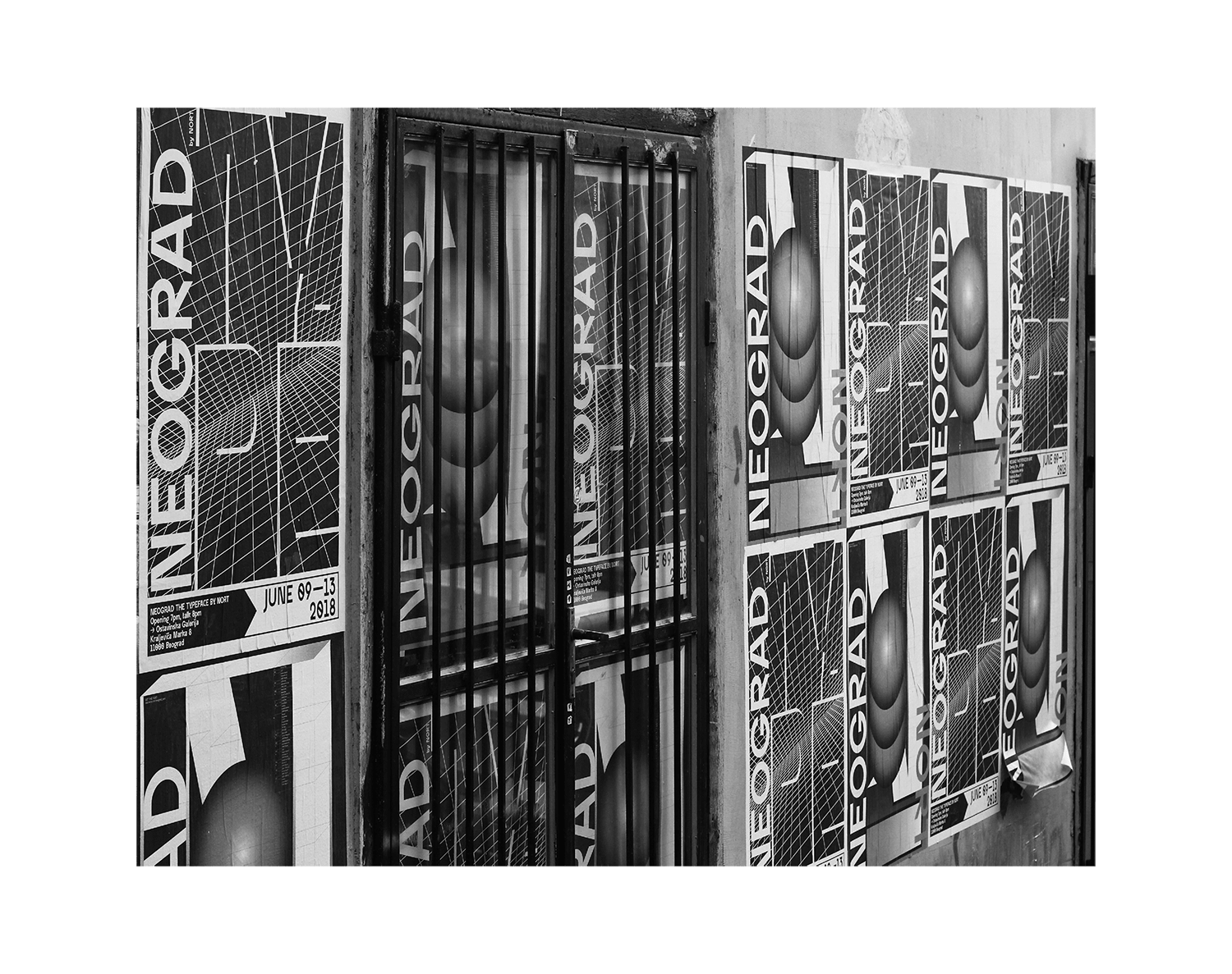
Neograd is a modern typeface designed in 2018 by Nort and shared with serbian graphic designers for cultural projects. Inspired by the urban space of the city of Belgrade and its public display structures, the character set considers the use of the Cyrillic and Latin alphabets of Serbian culture. April the 11th of the year 1948 marks the beginning of the construction efforts of “youth brigades” in monumental project of building new Belgrade. Before world war two mostly covered with sand and swamps, this place has had a huge transformation from fifties to eighties of 20th century. Architecture of this monumental project was inspired by Corbusier's ideas and spirit of internationality. Project was realized with help of working actions in which 200'000 workers volunteered. Idea was to achive new living and working place which will be in function of a new Yugoslavian society. To create all this constructors closed their eyes for previous ways as well as tradition. Solution was found in constructing buildings from standardized elements, which could be freely combined. Untreated concrete becomes the main characteristic of style, something that later will be called brutalism in architecture. New language of shapes and design comes directly because of new technological breakthroughs relying on modularity and freedom of composing elements. Today this part of the city is a home for more than 300'000 people and stays in sharp contrast with a rest of the city mostly because of its size and brutal concrete face. Like it or not it stands as a monument to different times when was possible to imagine a new future and a new society. When future was about everybody. Neograd font pays respect to this era drawing its inspiration from rather brave but brutal shapes, folowing the spirit of earlier builders to whom creation was for societys good. Creating cyrilic and latin font NORT provided great tool for local culture to live and trive in challenging global context. (Zeljko Loncar, Graphic Designer, teacher and assistant director at the National College of Fine and Applied Arts, Belgrade. Co-founder of Cabinet SR:CH and collective Turbo Tomorrow)
2018
Editorial
Photography
Neograd sans
Neograd Specimen
NORT
230 x 324 mm
288 pages
Offset + Silkscreen + Embossing
Typeface:
Neograd sans by NORT
Video edit by Raphaël Piquet
Design by Théophile Glauser
+ Raphaël Picard (Quadraat)
Project management by Sébastien Doutaz
Published as part of the residency and exhibition “Shaping the Future” Ostavinska gallery, Belgrade (RS). Powered by Le Cabinet-SR:CH.
Most people have extremely romantic views of a life of an artist. Musicians, fine artists, dancers, actors or designers – they sleep long, they travel, dream, meet nice and smart people, lead intriguing dialogues and discussions, they fulfill their fantasies and, eventually, some of them receive awards and fellowships, they get acknowledged and become famous or infamous. Many of them lead nomadic lives, travel from project to project, from one side of the globe to the other, they tour and perform, stay at hotels and eat fancy catering in the green rooms. But somewhere amidst all of that, they need to create. They need to go through those painstaking and challenging processes of self-doubt, trial, error and accomplishment. They need to create something meaningful, for them and hopefully for others too. To do that, they need the space, and they need the time. For many of us, these are the most precious currencies, as time seems to be perpetually slipping away into a whirlwind of precarious work cycles and vanity of digital social immersion, by which we try to decompress from the hectic everyday. Getting out of your “ comfort zone ” has become the mantra of the so-called creative class. Unfortunately, this is more often an empty idiom than a real challenge that an author will impose on him or herself. Displacement, however, seems to be the key to accomplish this, and so different retreats or residencies absurdly become the rare comfort zones within which an artist can conquer time for themselves and focus on developing and producing their work. An entire “ market ” of residencies has emerged from this need, offering different formats and support systems, while artists are even investing their own resources in organizing such creative oases for themselves… (Relja Bobic Curator, Manager / Nova Iskra)
2018
Editorial
Other
Neograd sans
Shaping the Future
A New Residency
Le Cabinet-SR:CH
305 x 440 mm
36 pages Offset
Typeface:
Neograd sans
by NORT
Design by Théophile Glauser
+ Raphaël Picard (Quadraat)
Project management by Sébastien Doutaz
Published as part of the residency and exhibition “Shaping the Future” Ostavinska gallery, Belgrade (RS). Powered by Le Cabinet-SR:CH.
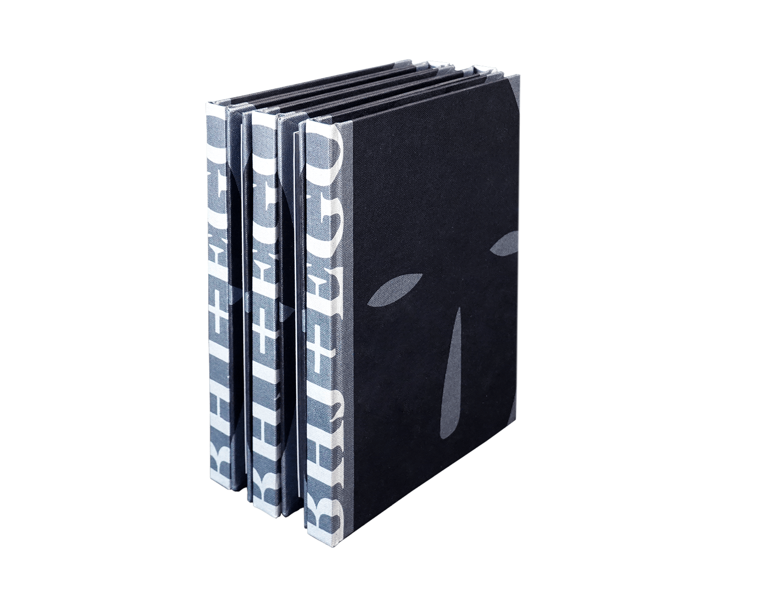
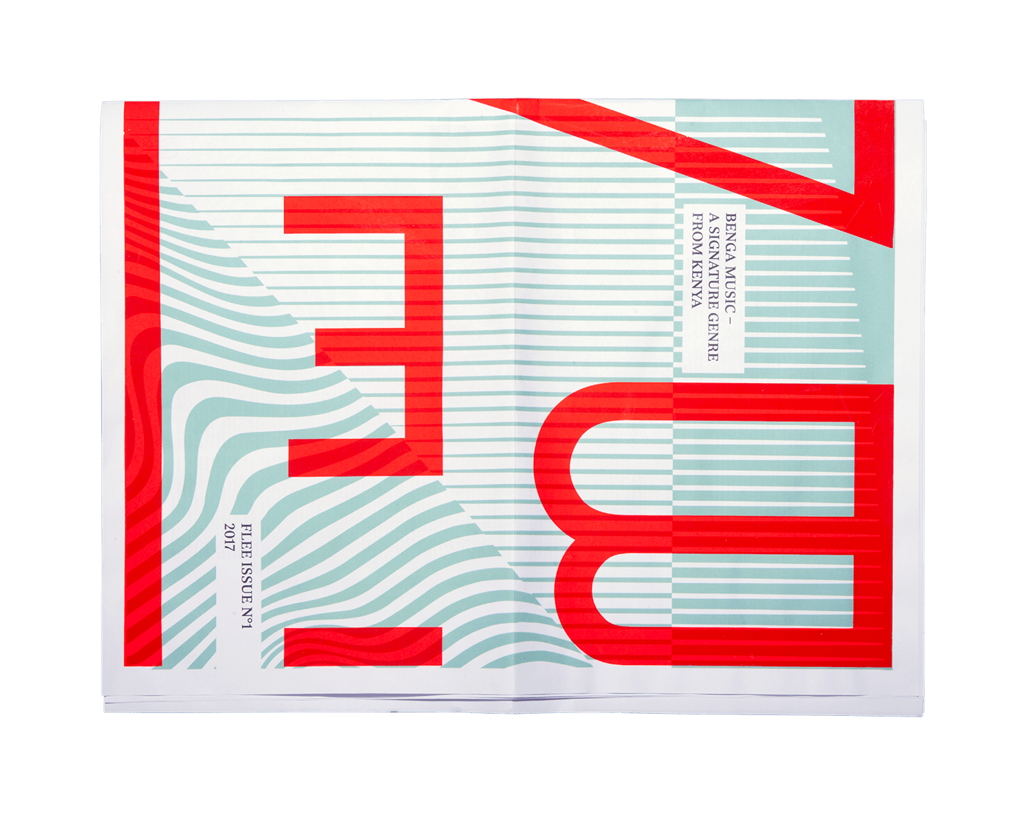
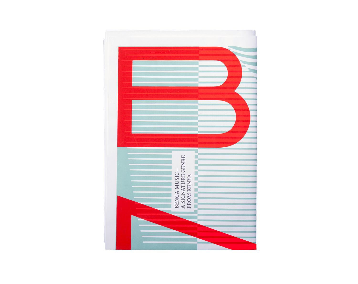
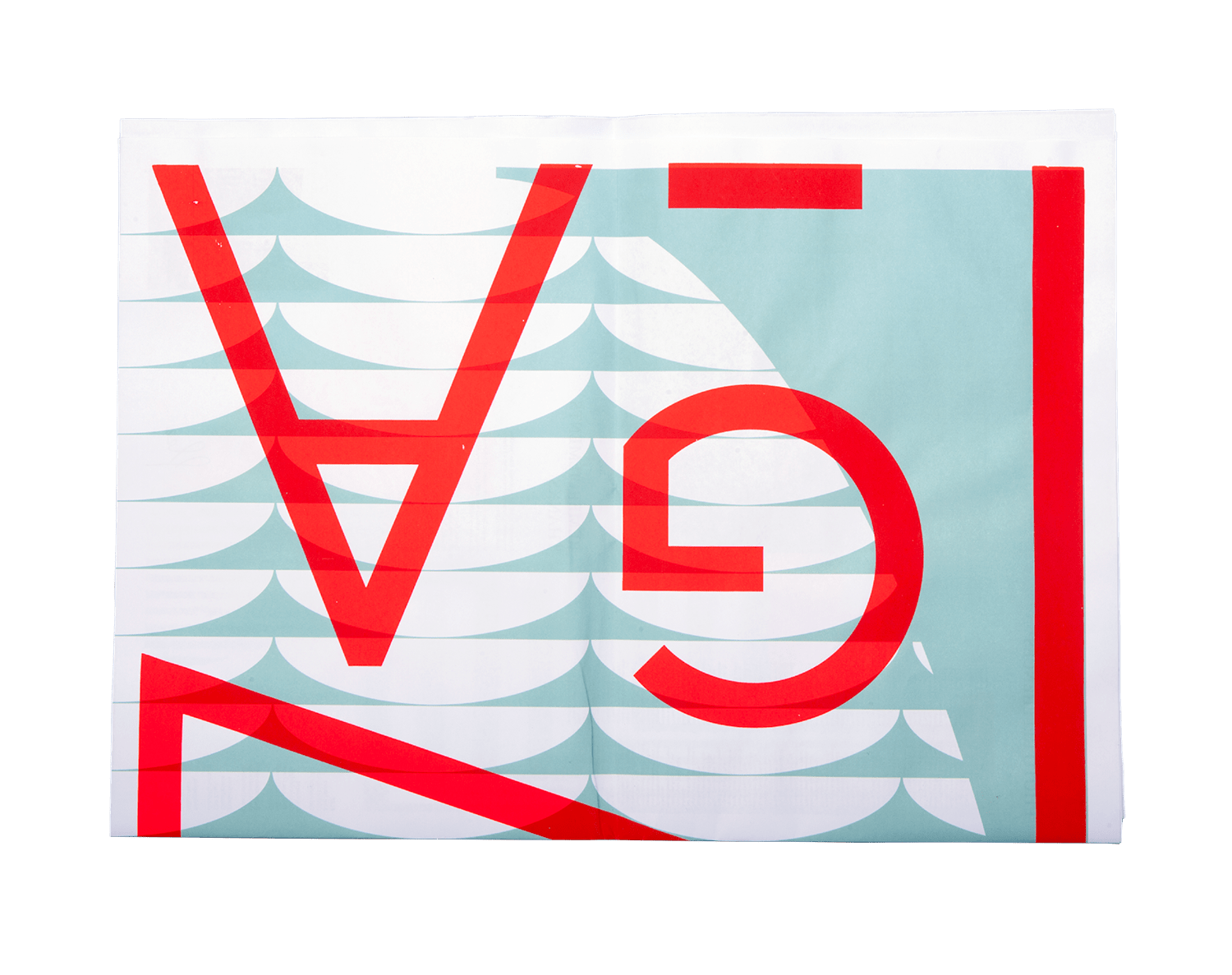
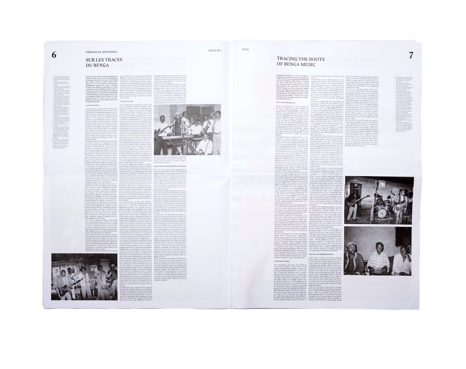
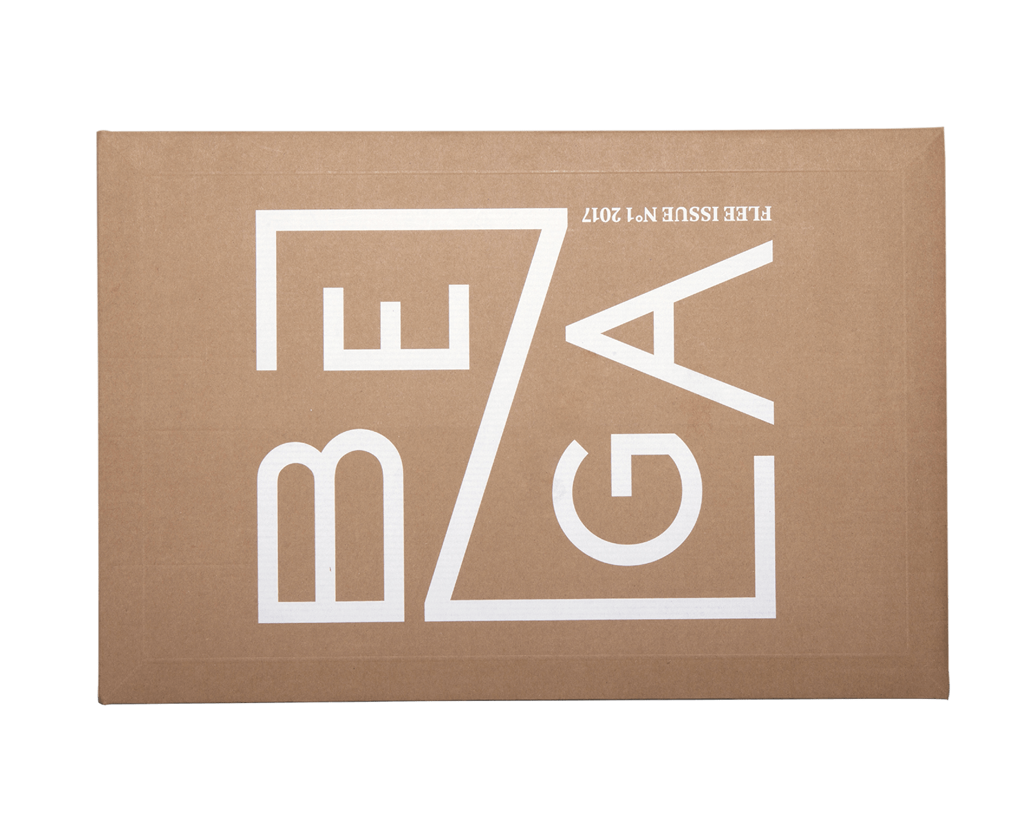
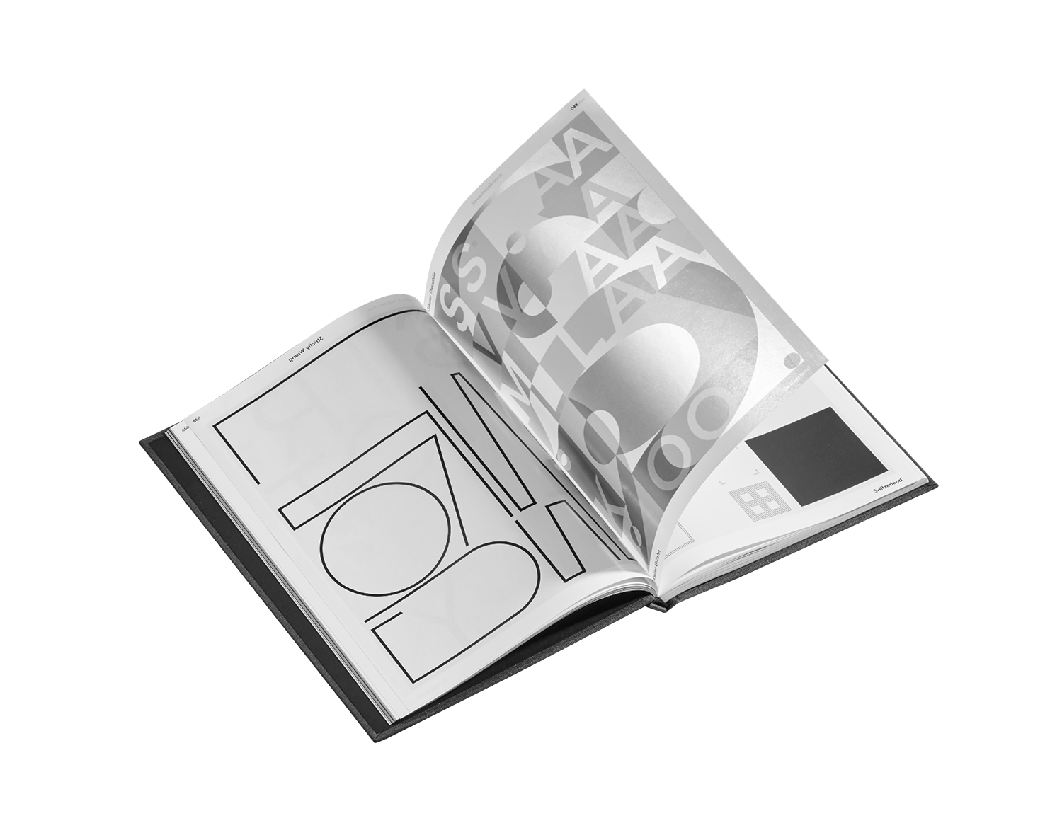
For the past two years, FLEE has been working on its first issue entitled Benga Music - A Signature Genre from Kenya. Conceived as an attempt to document a Kenyan timeless music genre - benga - this issue is also a visual and audial tribute to the heritage of East African music. Approaching this musical genre with a new and innovative perspective, the first release of FLEE features a vinyl compilation and a printed journal. Faithful to the local essence of the genre while transcending unproductive nostalgia, the two objects ensure that the vibrant traditional roots of the benga movement interact with a contemporary approach. To make this initiative possible, we joined forces with celebrated Kenyan journalists, Ondiso Madete and Emmanuel Mwendwa, and collaborated with renowned international specialists such as Douglas Paterson. This great teamwork translated into a well-documented manuscript, with exciting articles, exclusive authentic photos of the era and creative present-day illustrations celebrating the genre. Accompanying the journal, the record tells a surprising story, starting with the pioneers of benga (Daniel Owino Misiani, George Ramogi and the Migori Superstars) and concluding with the modern respectful re-interpretations of Nik Weston, Jaakko Eino Kalevi, and Africaine 808, blowing the dust of the original scores. (Flee Project).
2017
Editorial
Sound
Benga Music
Flee Project
155 x 220 mm
80 pages
Offset + Silkscreen
Typeface:
Rubis by Nootype
Silkscreen by U-Zehn
Design by Théophile Glauser +
Sébastien Doutaz +
Jason Voiblet
Benga – A Signature Genre from Kenya. Published by Flee project, distributed by les presses du réel (FR).
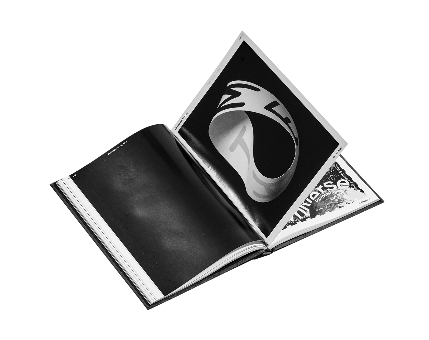
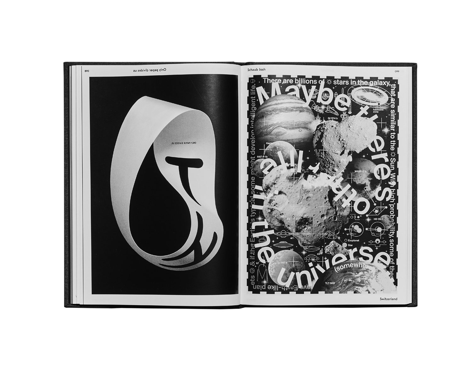
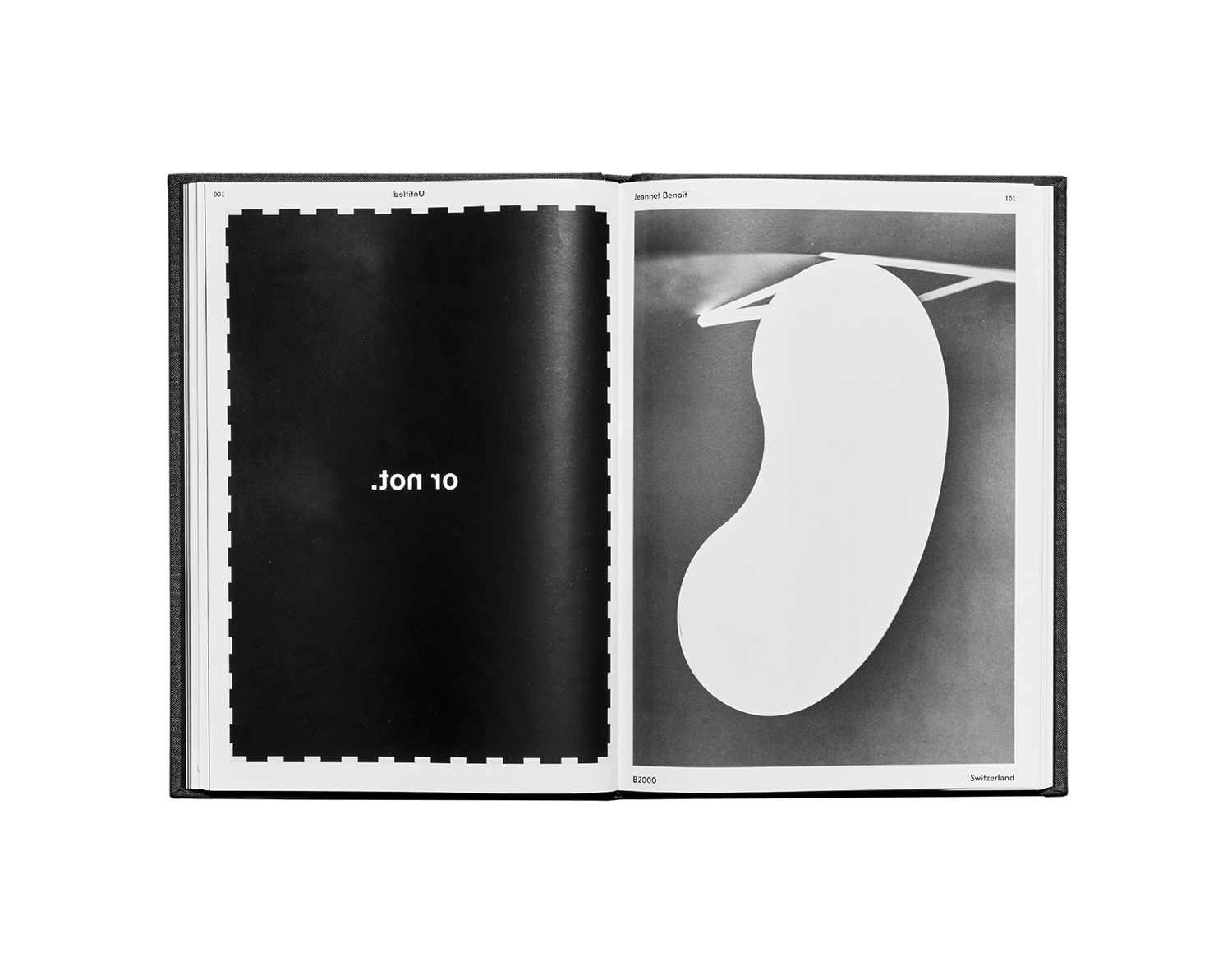
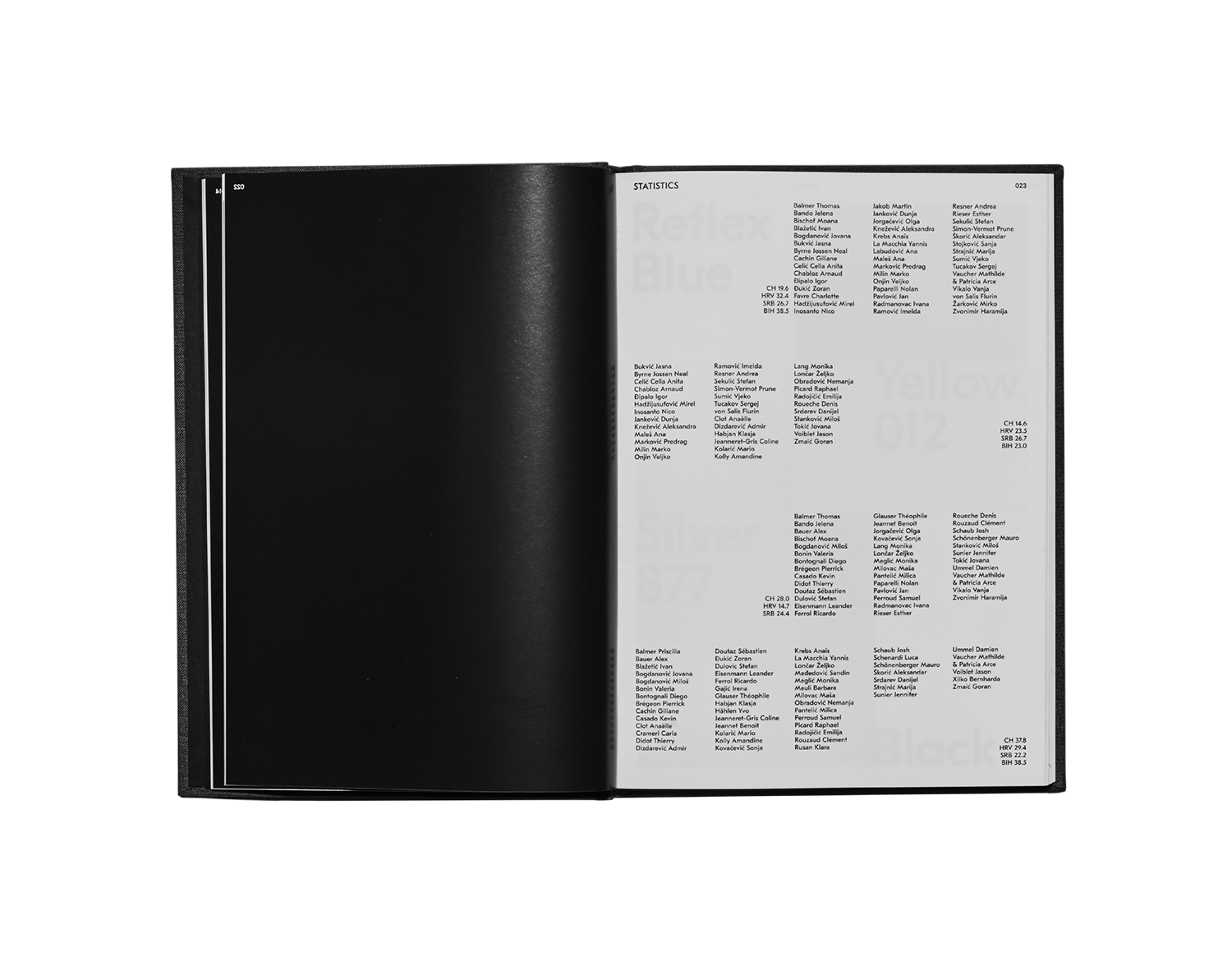
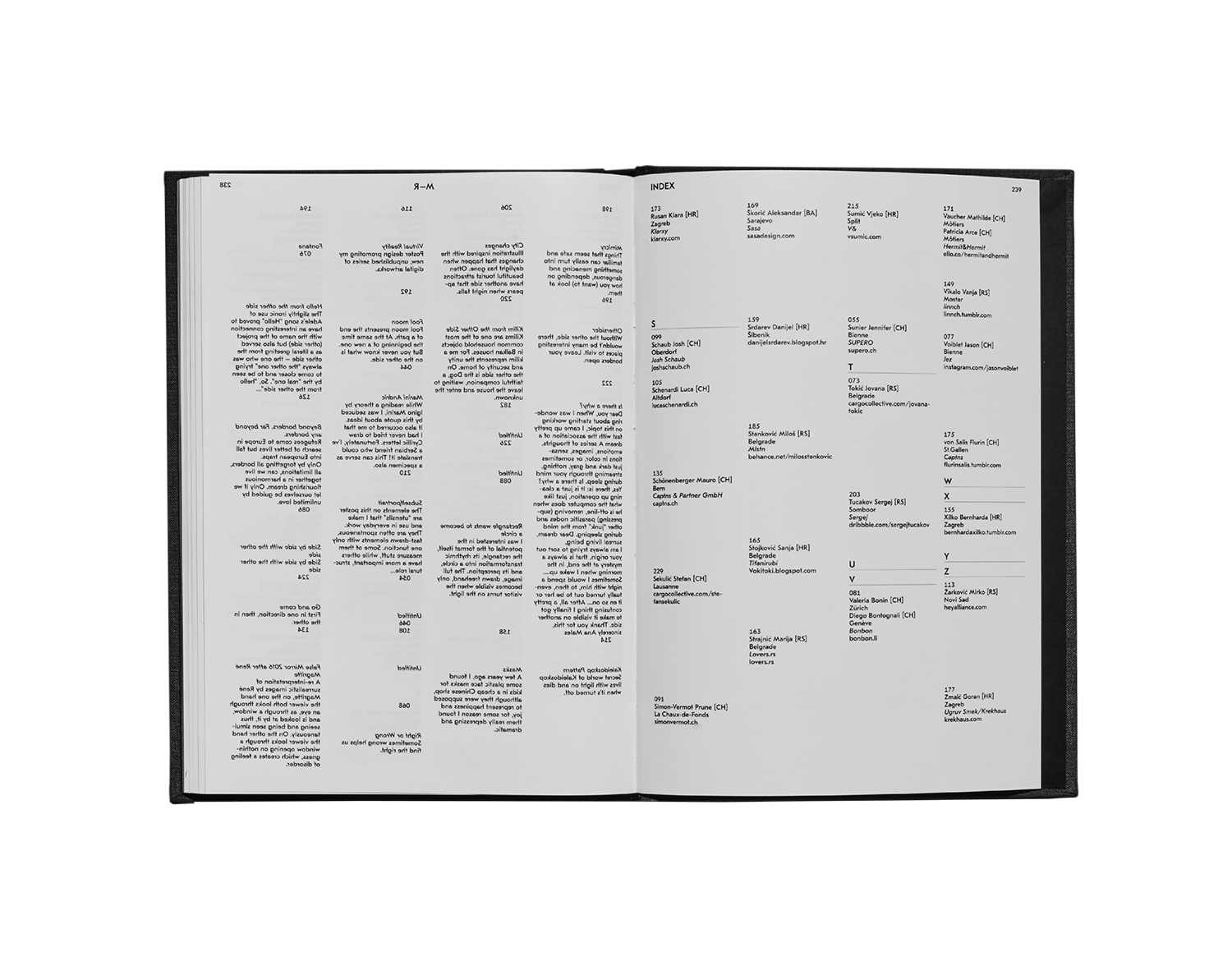
89 participants from Switzerland, Serbia, Croatia and Bosnia. The exhibition OTHER SIDE is a continuity of the one done in Serbia, two years before. This time, 89 participants of 4 differents countries were invited to develop a two sides poster project. The aim is to encourage the artists to come to grips with a subject that confronts them either directly or indirectly and to go beyond preconceived ideas. By inviting them to share an individual interpretation, the posters introduce us to different cultures with different personal concepts. The artists will thus deal with a range of everyday subjects while struggling to break free from the usual clichés. These creations will also facilitate an encounter with Balkan artists, inviting them to compare their reality with that of the Swiss artists, and vice versa. This edition is the exhibition book of the « Other Side – An interactive poster project by Swiss and Balkan artists », presented from march to june 2017 in Quartier Général, La Chaux-de-Fonds, as the main exhibition of “Printemps Culturel 2017”, Neuchâtel.
2017
Editorial
Poster
Other Side
Le Cabinet-SR:CH
170 x 240 mm
240 pages
Offset + Embossing
Typeface:
GT Eesti by Grilli Type
Images by Benoit jeannet
Design by Théophile Glauser +
Published as part of the exhibition “Other Side an Interactive poster project by balkan and swiss artists”. Printemps Culturel / Quartier Général (QG), centre d’art contemporain de la Chaux-de-Fonds (CH). Curated by Le Cabinet-SR:CH (posters by: Balmer Hählen, Théophile Glauser, Leander Eisenmann, Josh Schaub, Benoit Jeannet).
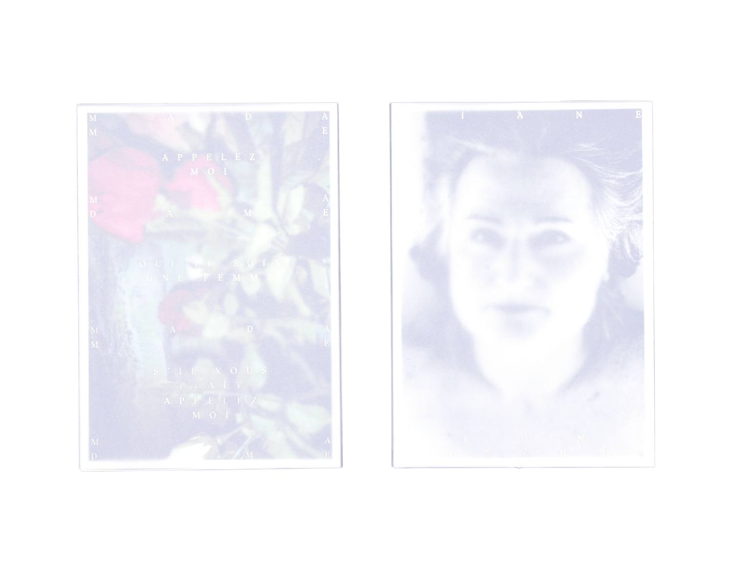
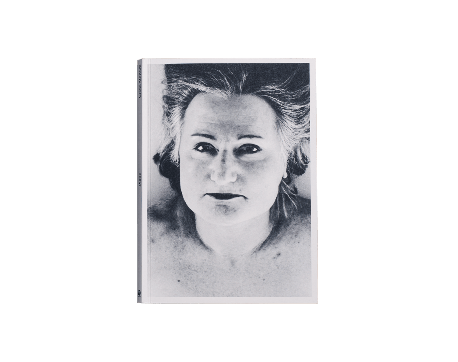
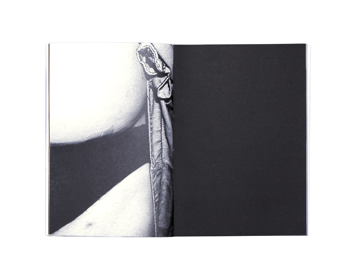
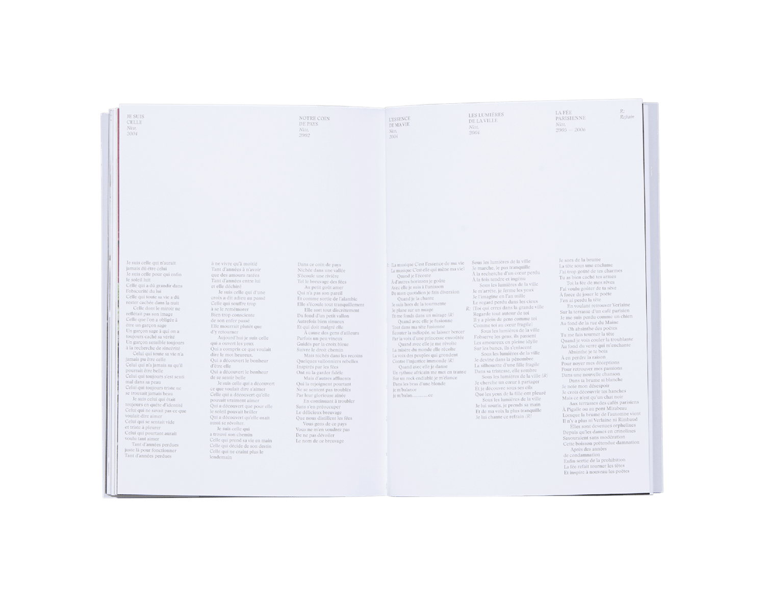
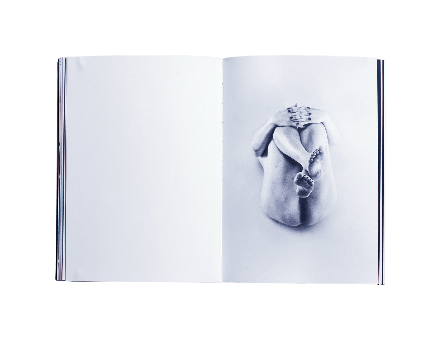
DIANE a documentary photobook journey on the life of a transexual singer in Switzerland.
“Diane is a singer dwelling in the small village of Boveresse close to Môtiers in Val de Travers, Switzerland. Involved in the cultural events of her city till 2009, she now spends most of her time to create music as well as working on defending the LGBT cause (Lesbian, Gay, Bisexual and Transsexual). Her rebirth and her under covering of life, Diane shares her history by song, she composes and sings melodies inspired among others by Brel, Brassens or Vian. I knew Diane in 2013, at the vernissage of her first album. Since then I have really wanted to investigate the meaning of the term change. Diane appears to me as an example of courage in the simplicity of a profound decision. Issues related to gender studies, the attention of life and development of the LGBT movement, as well as the issue of territory and its culture are among the themes of this book. I hope that the confrontation with these themes, the possibility of speaking simply through a mixed language between photography, anthropology and writing, can encourage debates and exchanges and desacralize a good number of clichés that exist for people, sometimes unconsciously. In the current social and political landscape, it seems important to me to facilitate the approach and discussion around these subjects. The point of this work lies in the desire to tell a very charged and complicated story, doing it in a natural human and genuine way, like the way Diane deals with her choices”. Giona Mottura.
2017
Editorial
Photography
Diane
Giona Mottura
155 x 220 mm
80 pages
Offset + Silkscreen
Typeface:
Stanley
ISBN 979-10-92265-61-3
Design by Théophile Glauser
Published as part of the exhibition “Diane” from Giona Mottura Festival Voie Off, Rencontres d’Arles (FR).
2013
Editorial
Other
Sugus Typework
Hochschule der Künste Bern
140 x 200 mm
62 pages
Digital print
Typeface:
HKB / Viskom
Design by Théophile Glauser
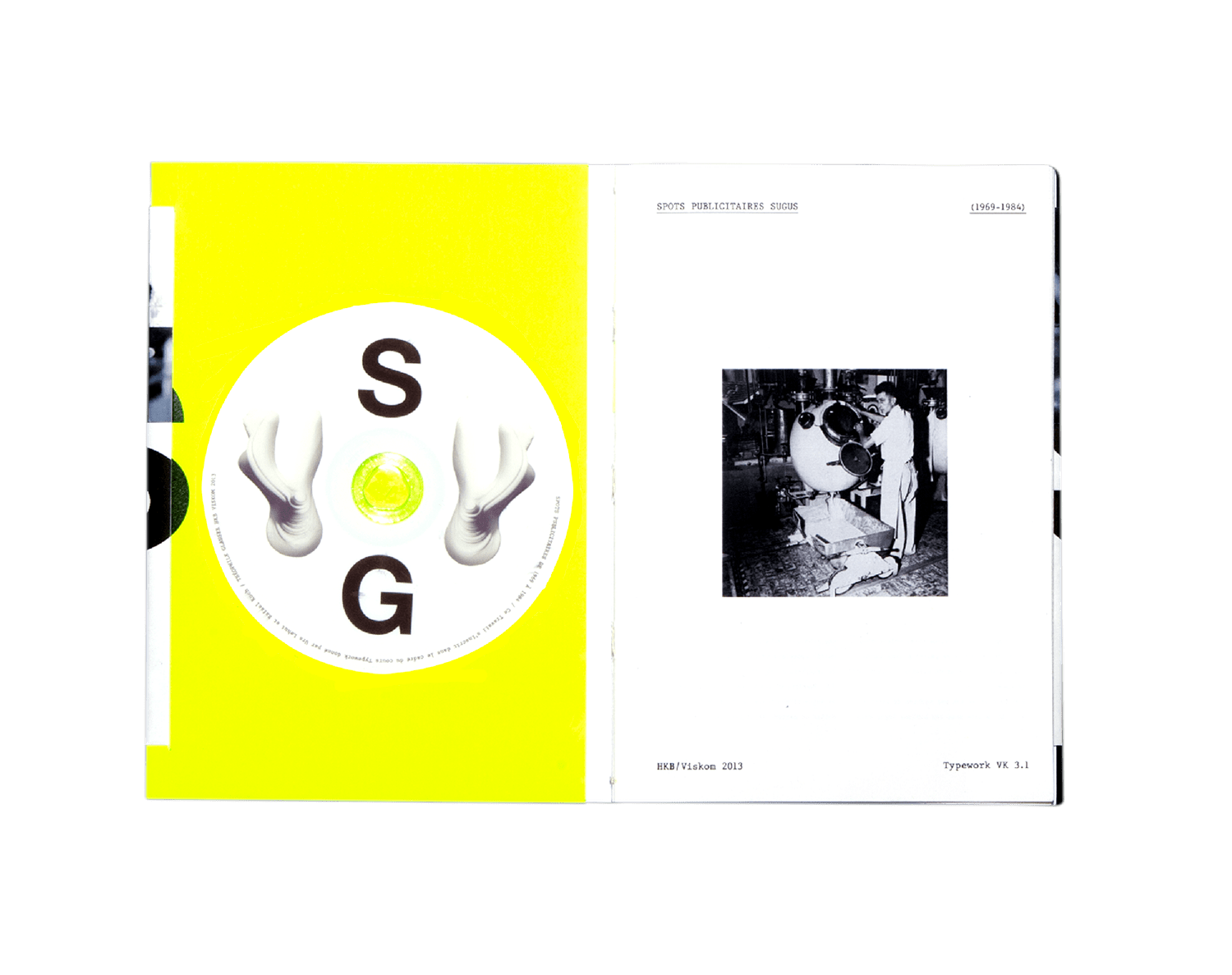
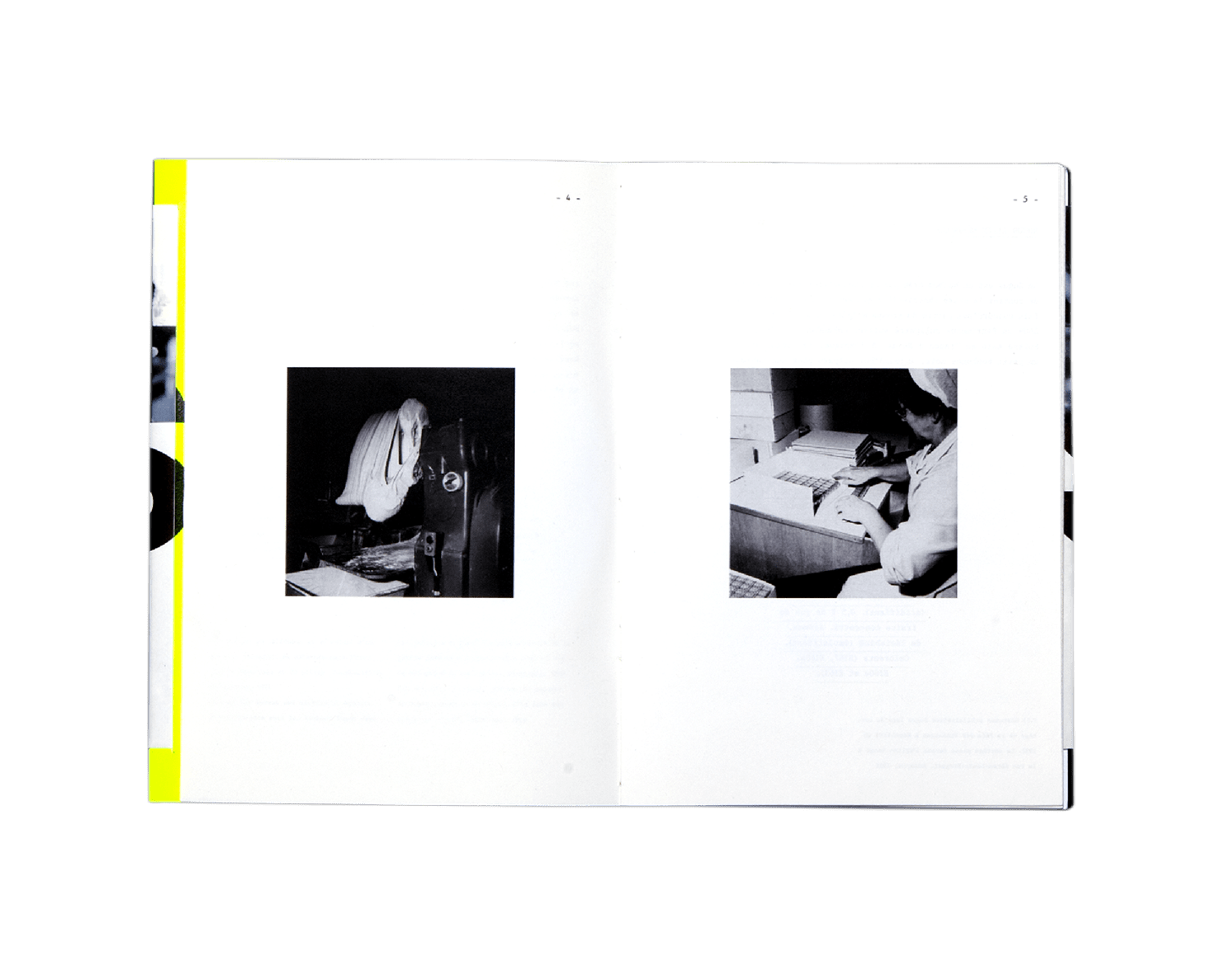
Advertising spot SUGUS (1969-1984)
Published as part of Typework VK 3.1 from Urs Lehni and Rafael Koch, archive pictures: DAV, Département audiovisuel, La Chaux-de-Fonds (CH).
